Colourful Fine Art Wedding Videography
Colour can be a statement, but it can also be a signature. Colourful fine art wedding videography is for couples who want bold palettes and confident styling, filmed with the restraint and composition of fine art. It’s editorial without feeling staged, cinematic without feeling forced, and designed to hold onto the emotion of the day while celebrating the aesthetic you’ve built around it.
If you’ve been searching for colorful fine art wedding videography, you’re usually looking for one thing: a film that makes vivid florals, black-tie fashion and saturated design feel elevated rather than chaotic. That comes down to control. Clean framing. Thoughtful pacing. Light handled with intent. And colour shaped in a way that keeps skin tones natural and the overall film timeless.
If you would like to learn more about fine art wedding videography, you can do so by following the link below to my page dedicated to this style.
Watch A Colourful Fine Art Wedding Film
If you’re considering a bold palette with a refined finish, the most useful way to understand this style is to see it in motion. Watch the film below and pay attention to how strong colour is handled with restraint, how black tie anchors the frame, and how the edit holds atmosphere without rushing through the details.
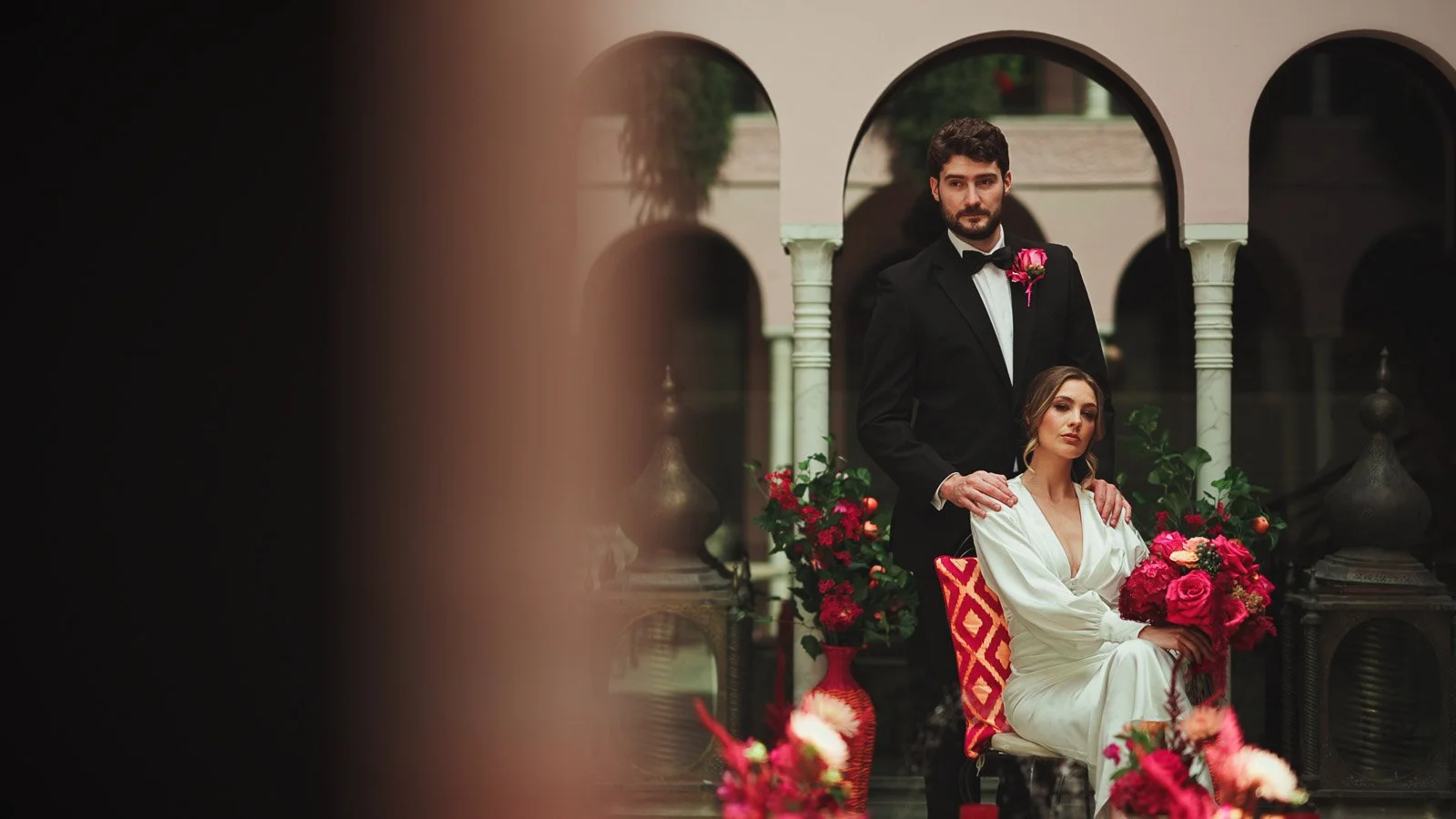
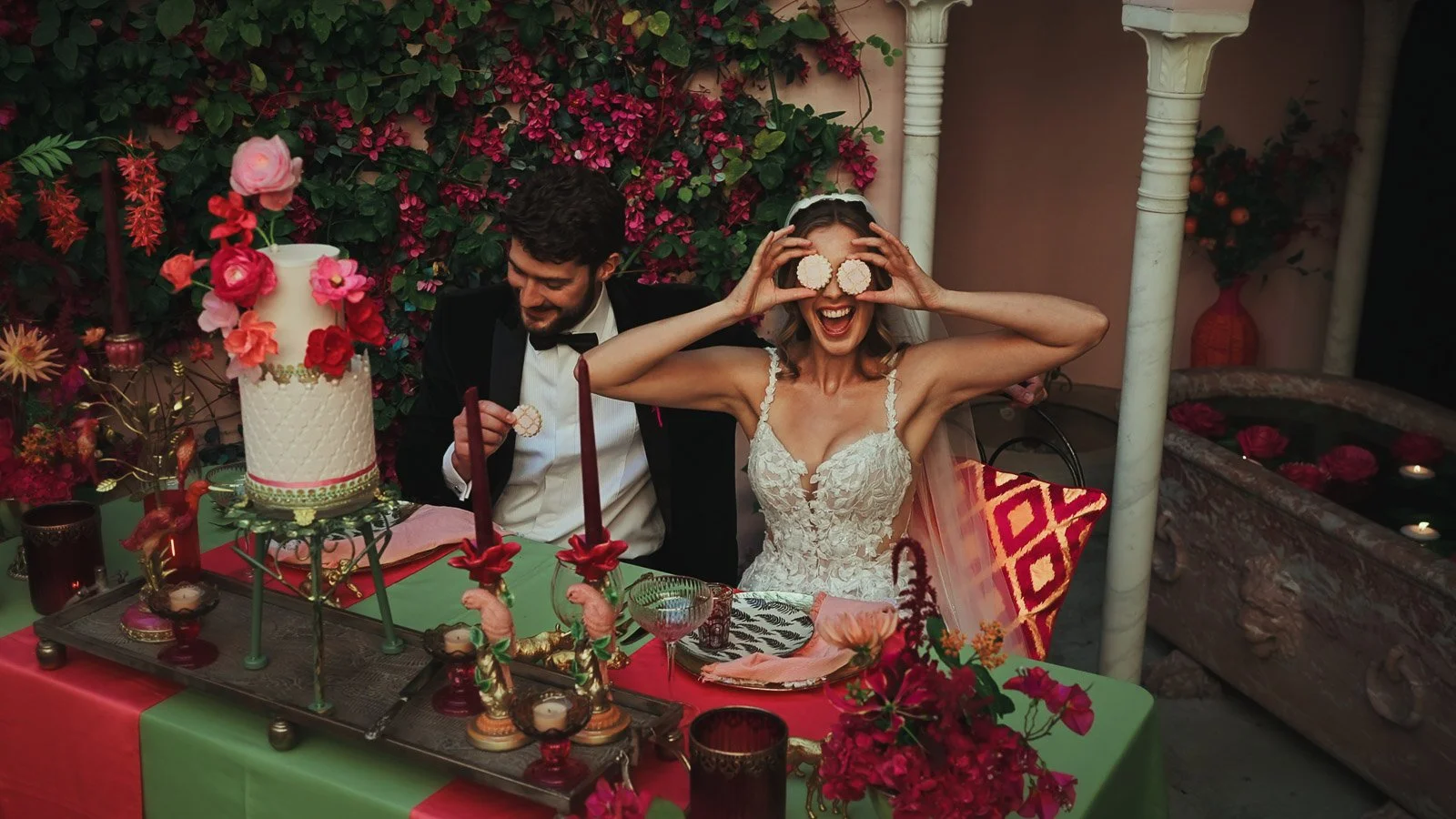
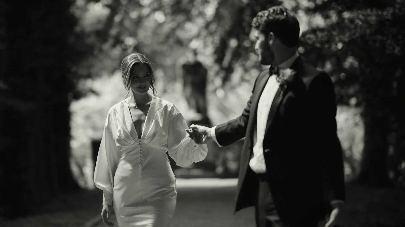
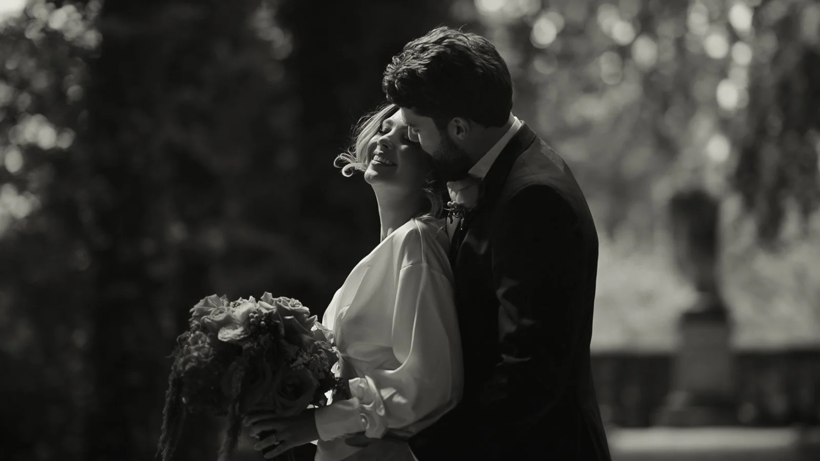
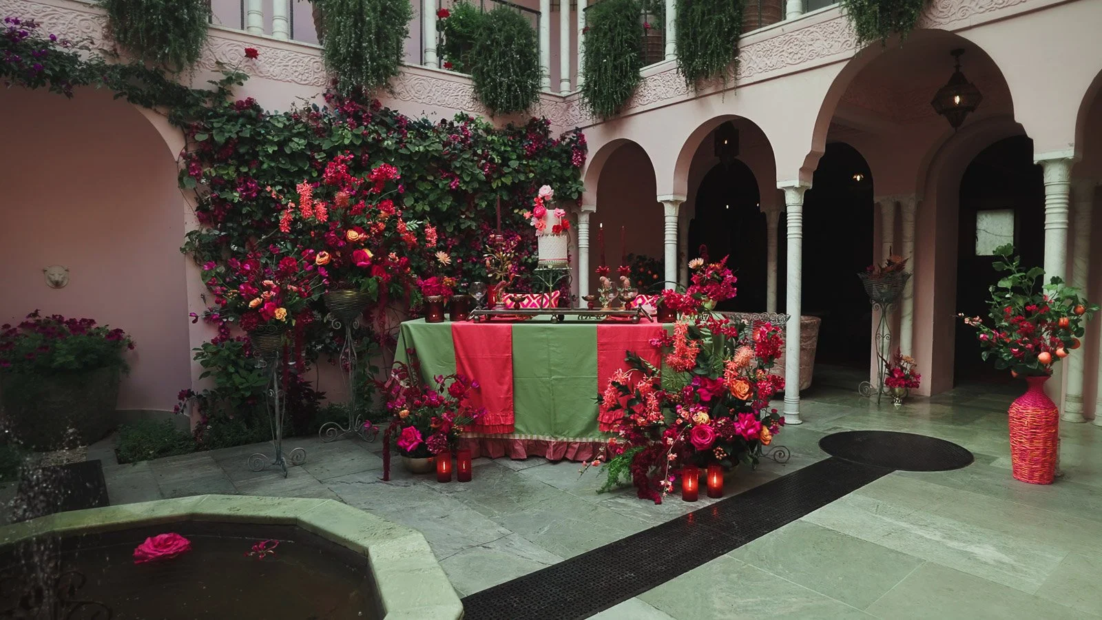
This piece was created as an editorial concept to explore a confident pink and red colour story with modern black-tie styling. The approach to composition, pacing and colour management is exactly the same as I use on wedding days, with the difference being that it allows the design to be showcased with total clarity.
What “Colourful Fine Art” Means in Wedding Film
Fine art isn’t a single look. It’s a discipline. It’s the difference between filming what is in front of you and filming with intention. When colour becomes bolder, that intention matters even more, because strong colour exaggerates everything. It can amplify beauty, but it can also amplify clutter, harsh light, or messy composition.
Colourful fine art wedding videography keeps the principles of fine art at the centre. Your frames stay clean and deliberate, your couple remains the focal point, and the day is edited with a sense of rhythm rather than rush. Colour becomes part of the story’s identity, not the story itself.
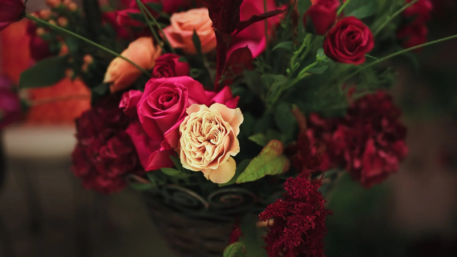
In practice, this means allowing bold palettes to exist in a way that feels expensive. Reds look rich instead of aggressive. Pink reads as confident rather than sugary. Florals become focal points rather than noise. Black tie anchors the frame. Architecture gives structure. And emotion remains the point of the film.
Why colour behaves differently on film
In stills, colour can be perfected in isolation. In motion, colour has to live in sequence. It has to transition from morning light to ceremony light, from portraits to reception, from daylight to candlelight. It also moves through space. A vivid floral installation changes as you walk past it. A courtyard scene shifts as the sun hits a wall. The atmosphere of a room warms up as the evening builds.
That’s why colourful wedding films either feel cohesive or they feel scattered. Cohesion comes from consistent tonal choices and controlled exposure, but also from how the story is structured. A bold palette needs breathing space. It needs intentional cuts. It needs moments where the viewer can settle into the scene rather than being pulled rapidly from detail to detail.
When done properly, colour becomes one of the strongest storytelling tools you can have. It defines mood. It creates contrast. It makes a venue feel distinct. And it gives the film a visual identity that feels designed, not accidental.
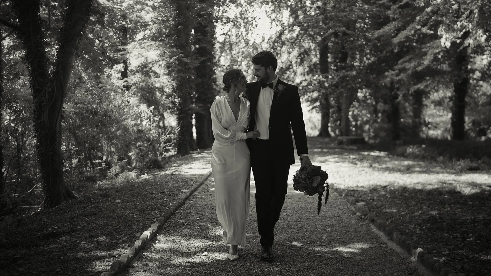
Black tie is the anchor that makes bold colour feel timeless
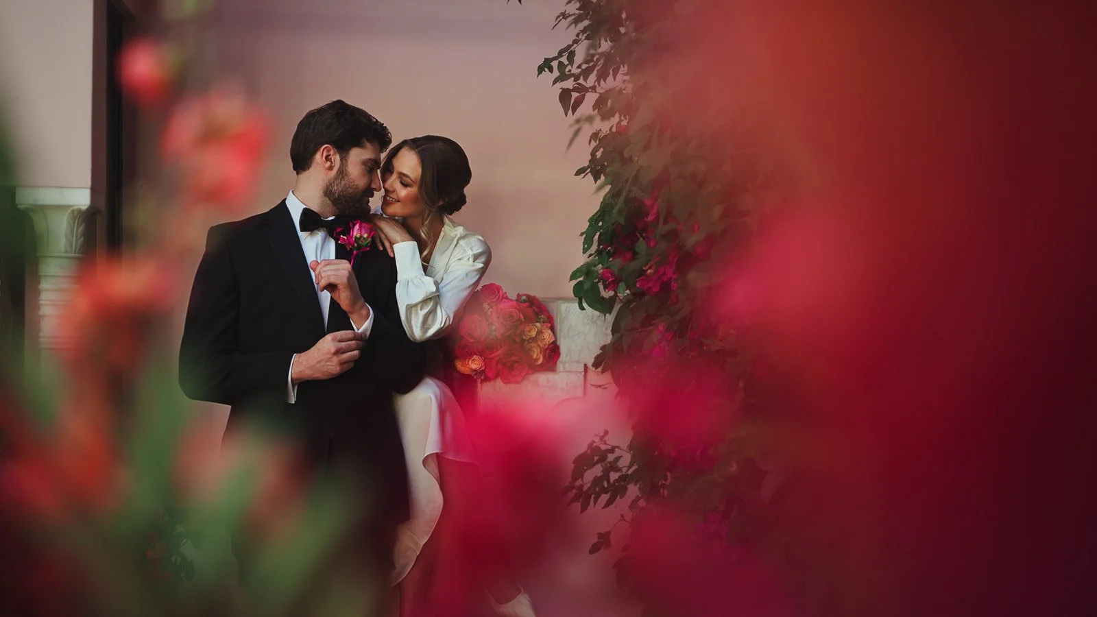
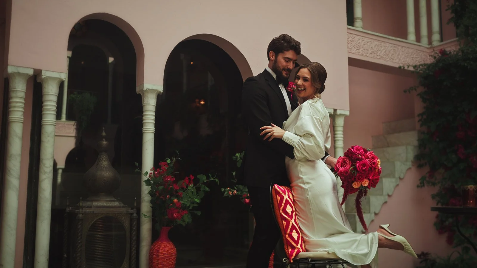
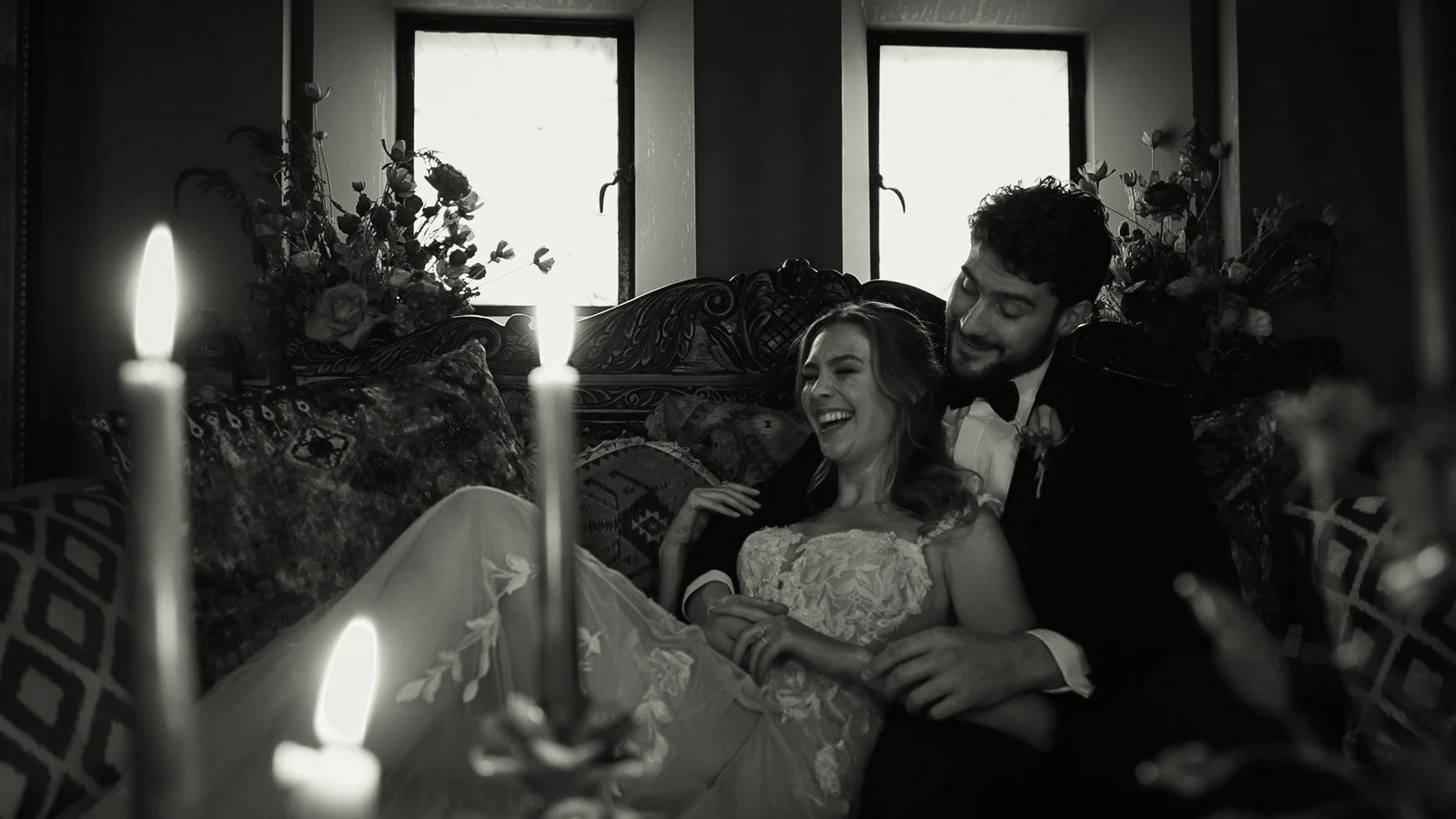
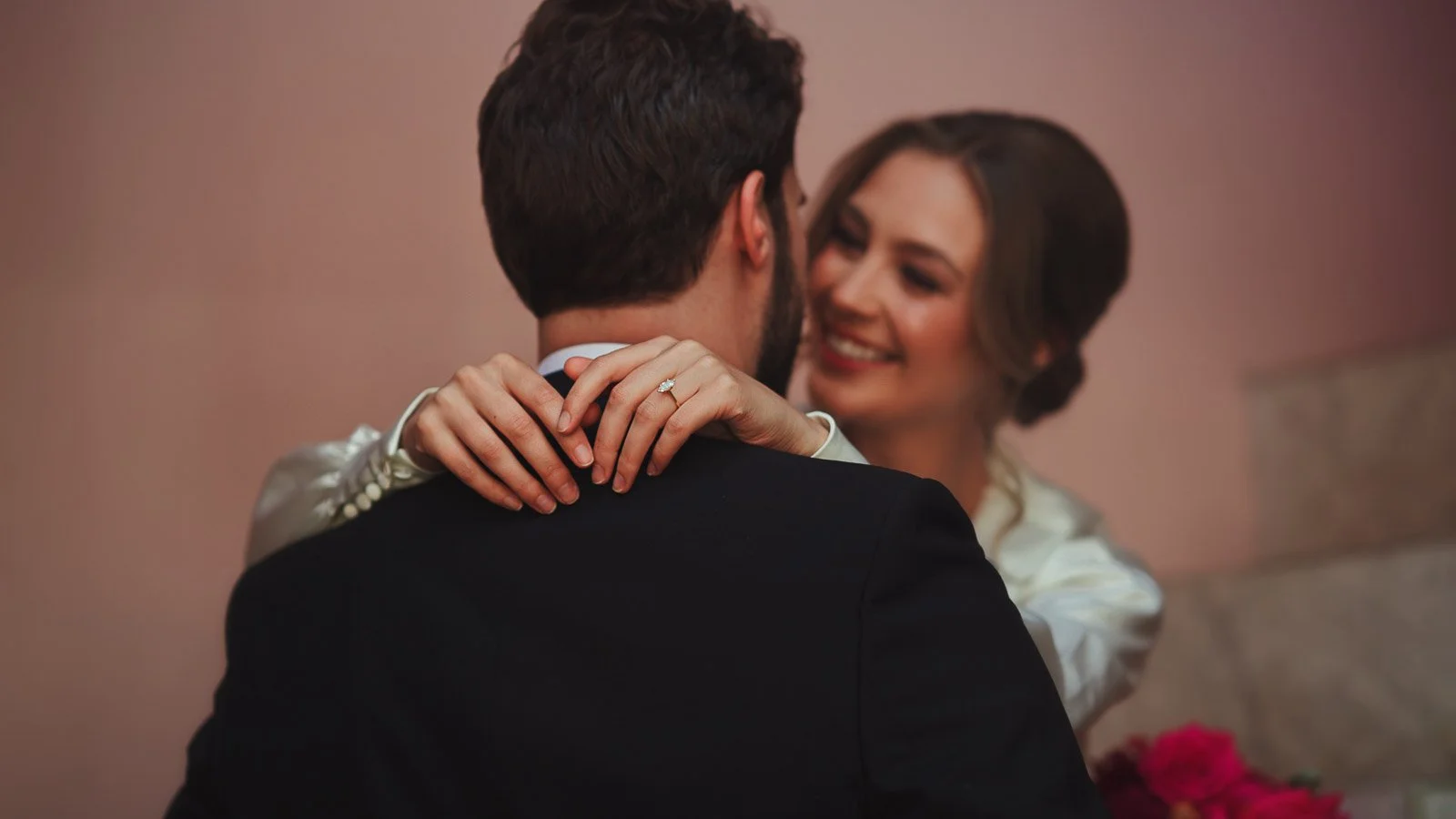
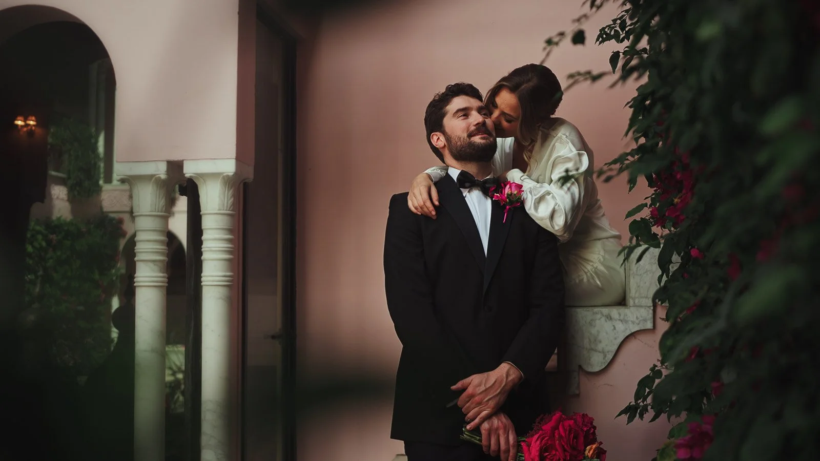
One of the cleanest ways to keep strong colour refined is to pair it with classic elements. Black tie does that beautifully. It introduces structure, negative space and simplicity inside the frame, which allows saturated florals and vivid styling to feel intentional rather than overwhelming.
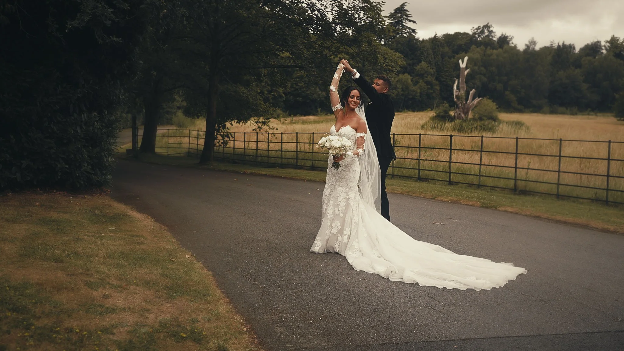
A tuxedo against bold florals will always read as modern and confident, because the aesthetic is grounded. Even when the styling is maximal, the couple still leads the image. This is exactly the balance you want if you love colour but you also want your film to feel like it will still look beautiful decades from now.
In a colourful fine art wedding film, the goal isn’t to turn colour down. It’s to give it context. Black tie provides that context.
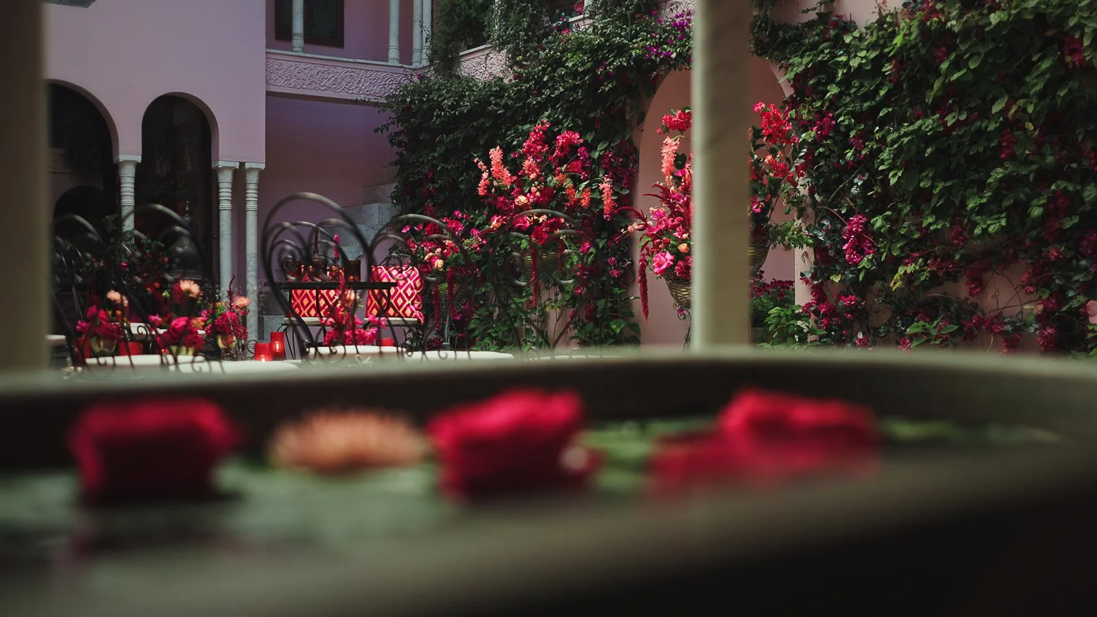
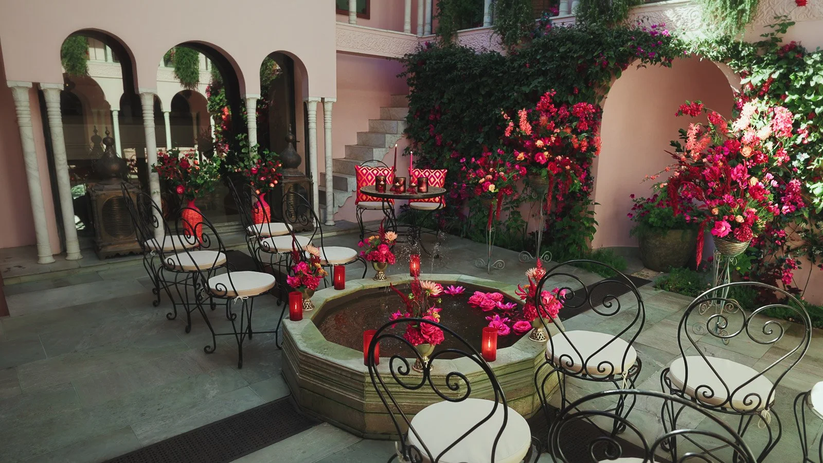
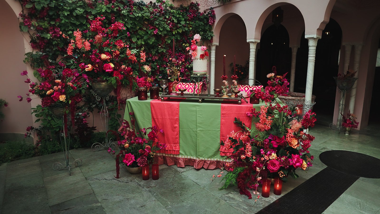
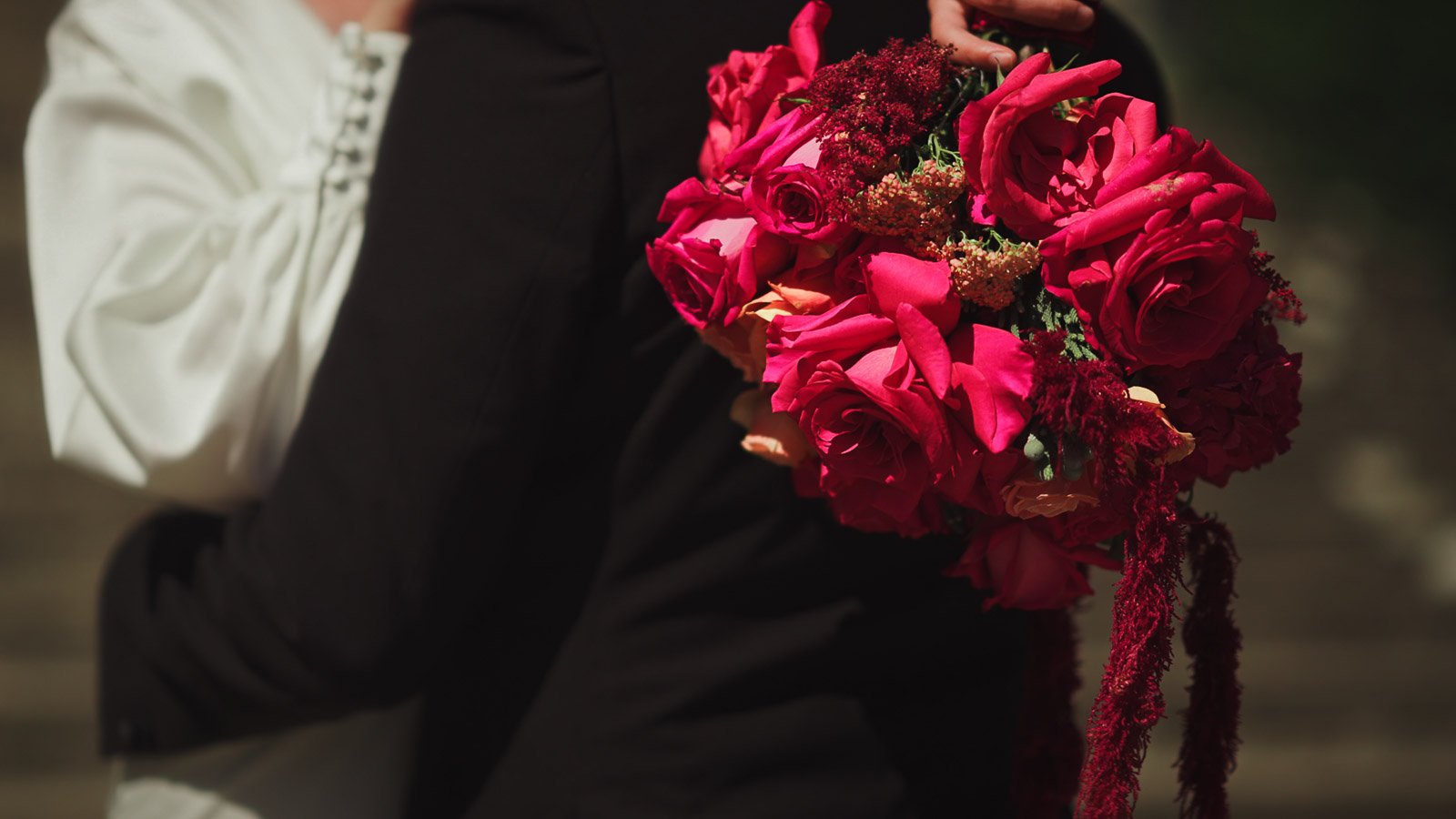
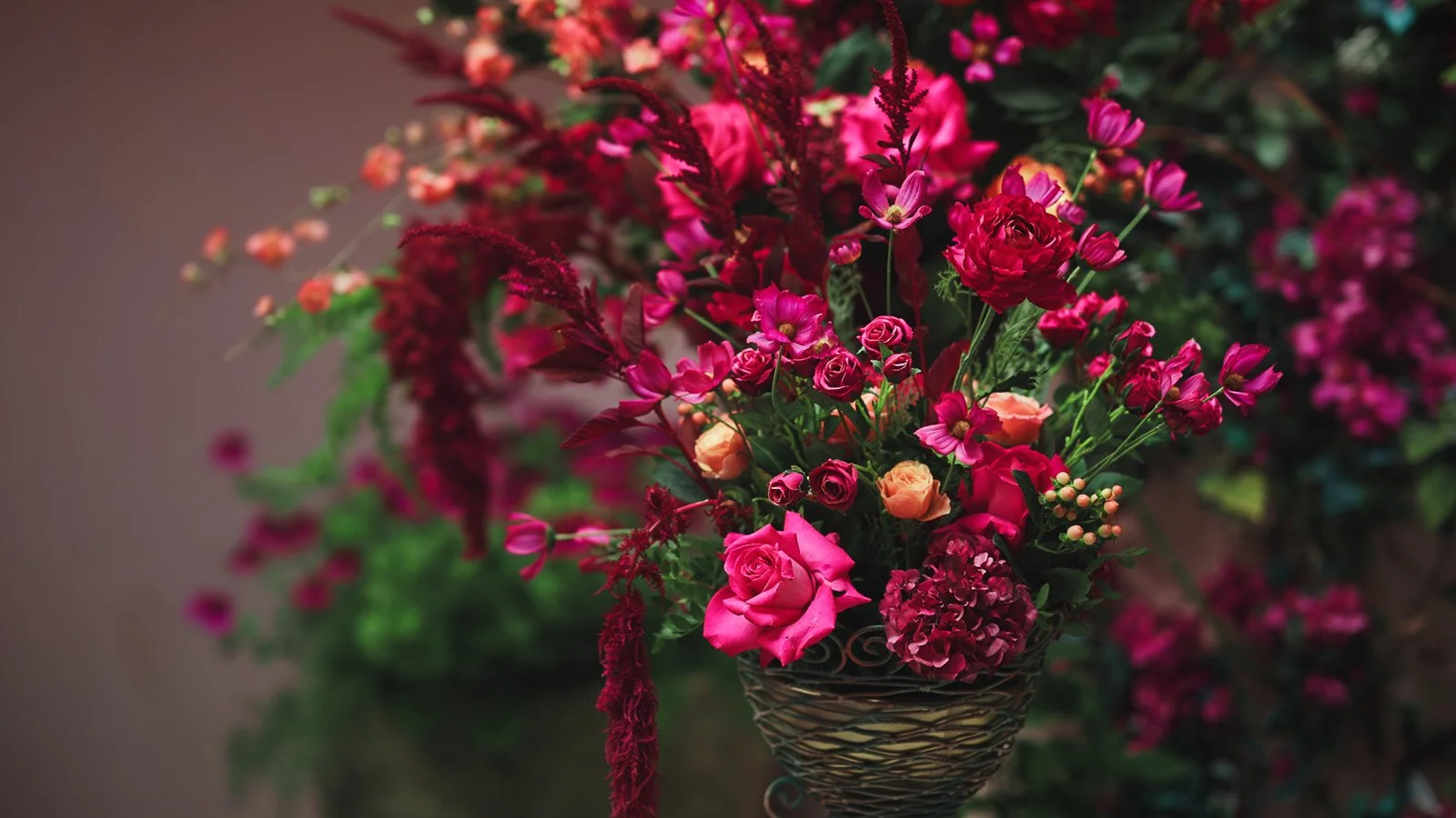
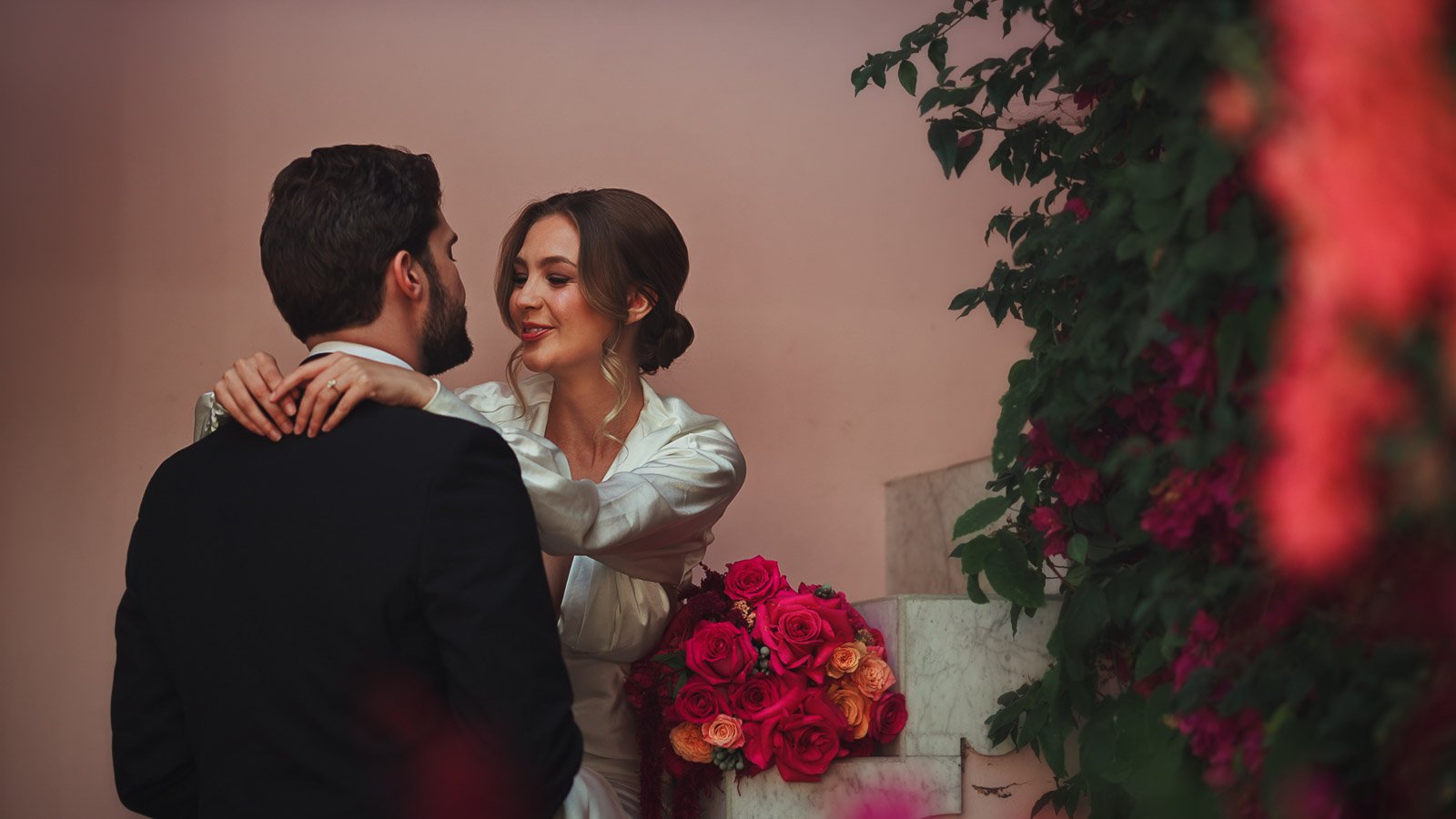
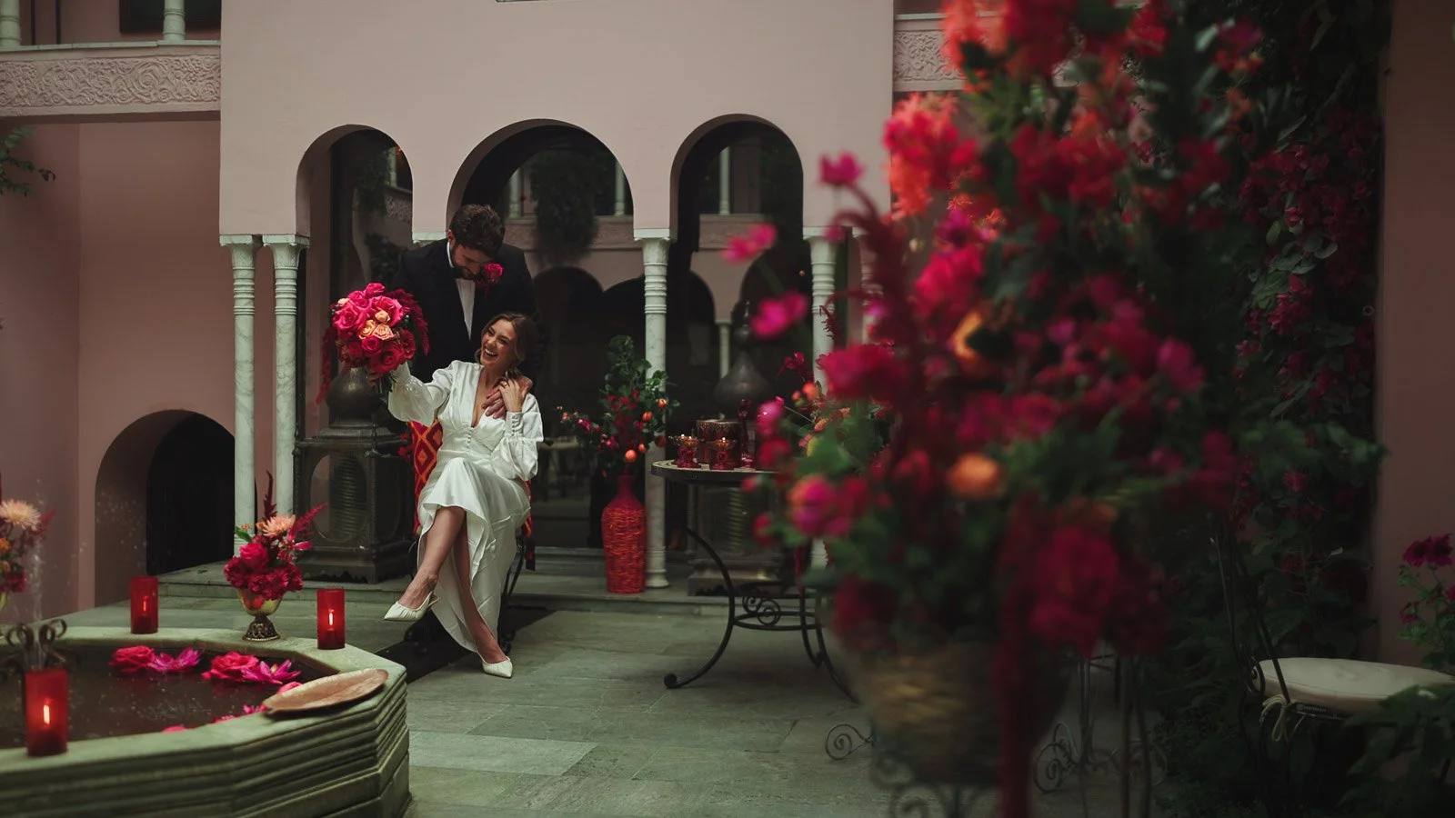
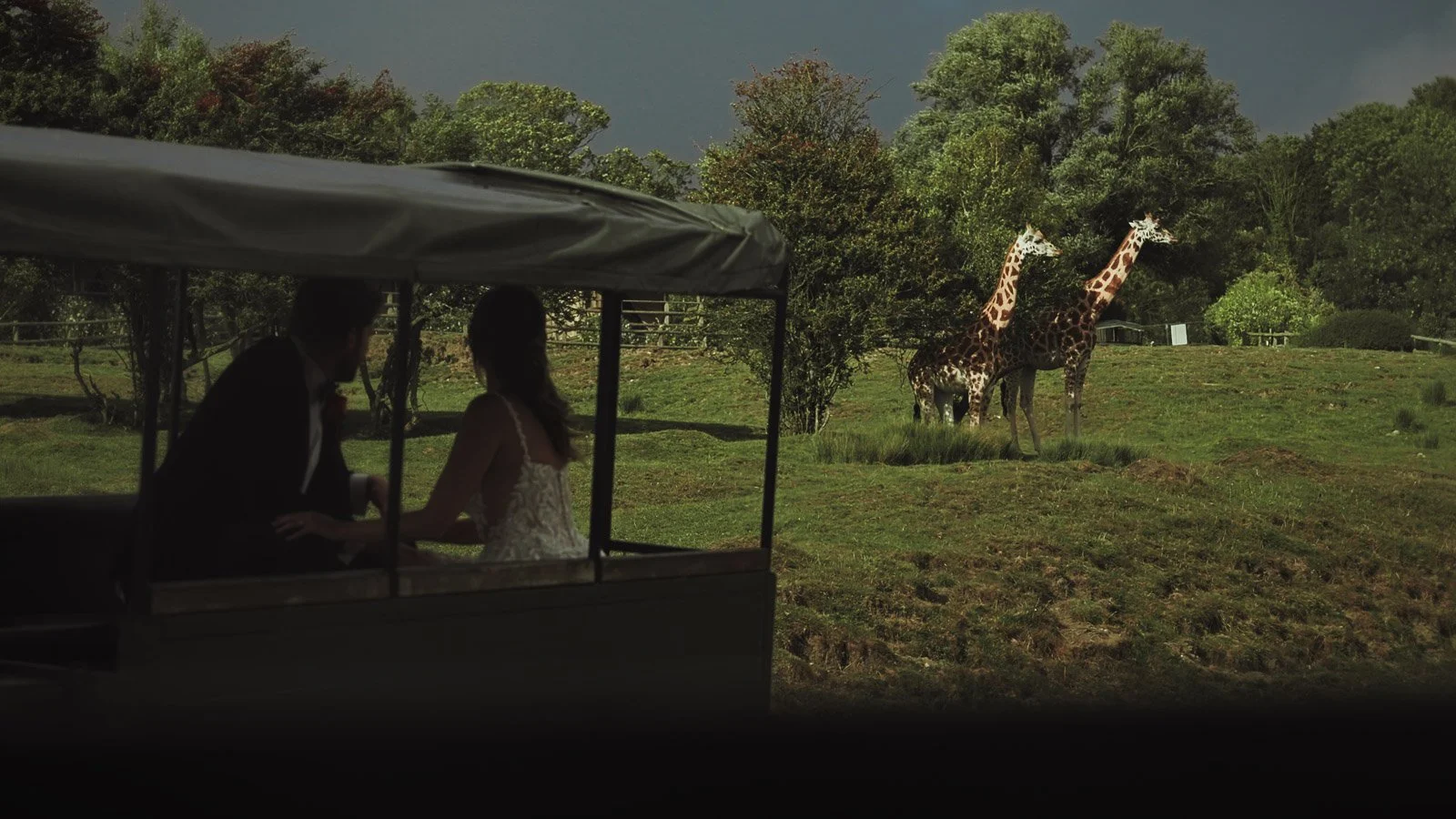
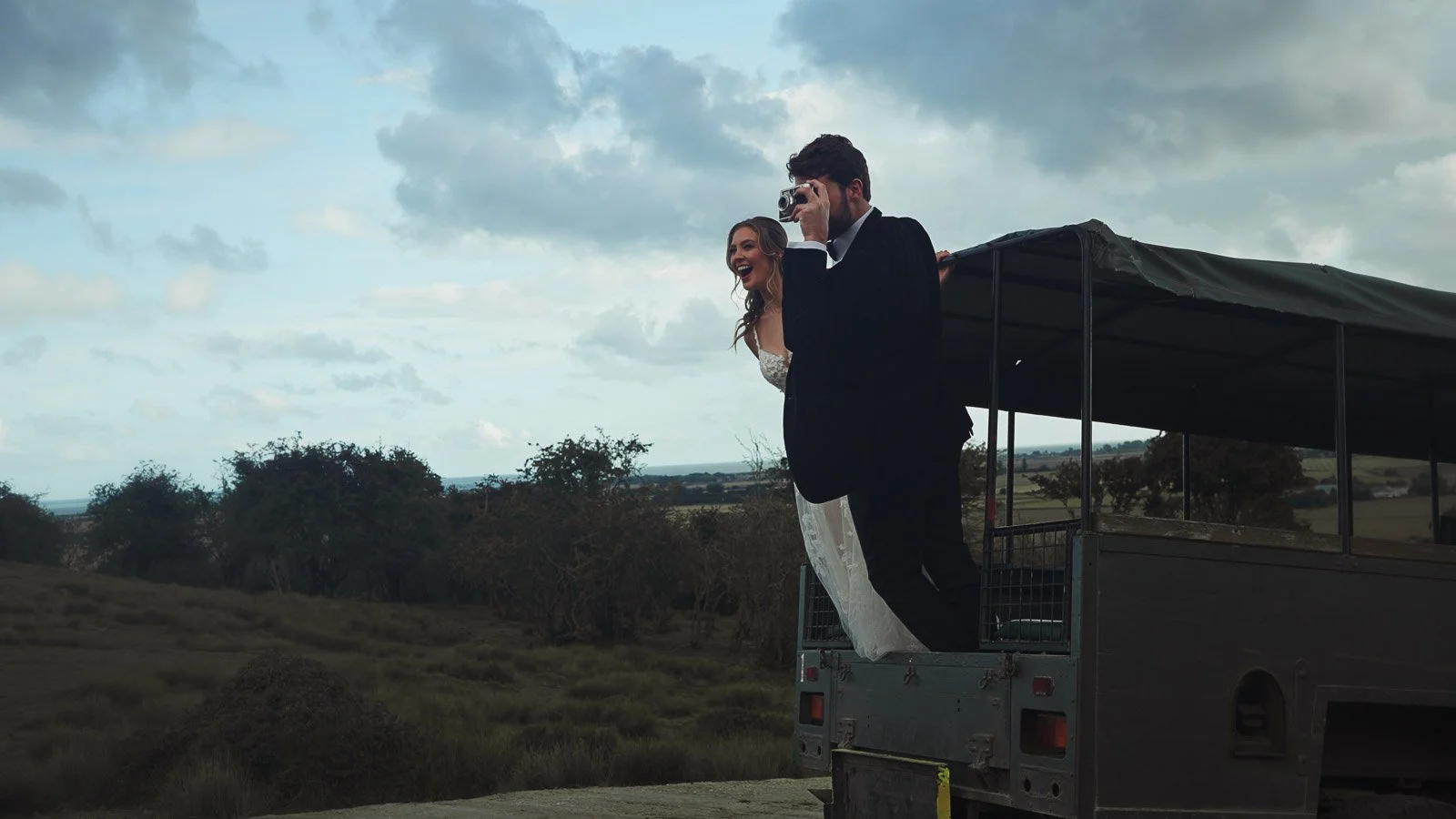
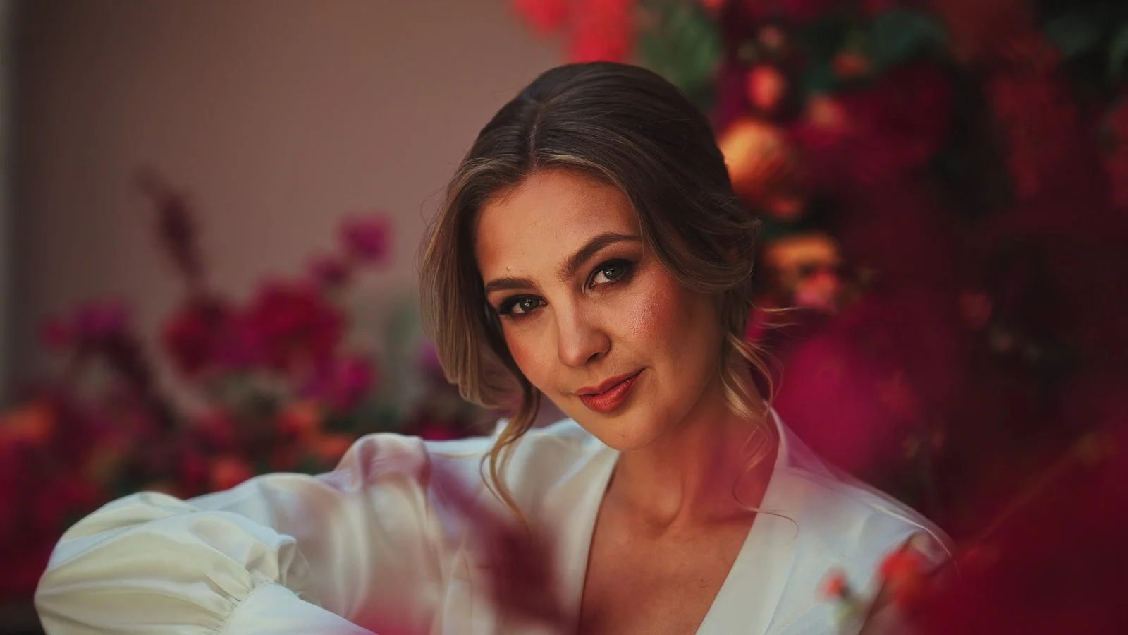
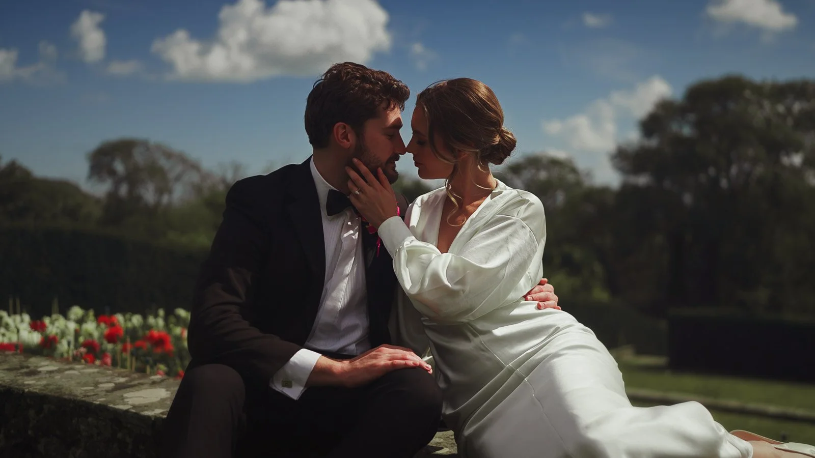
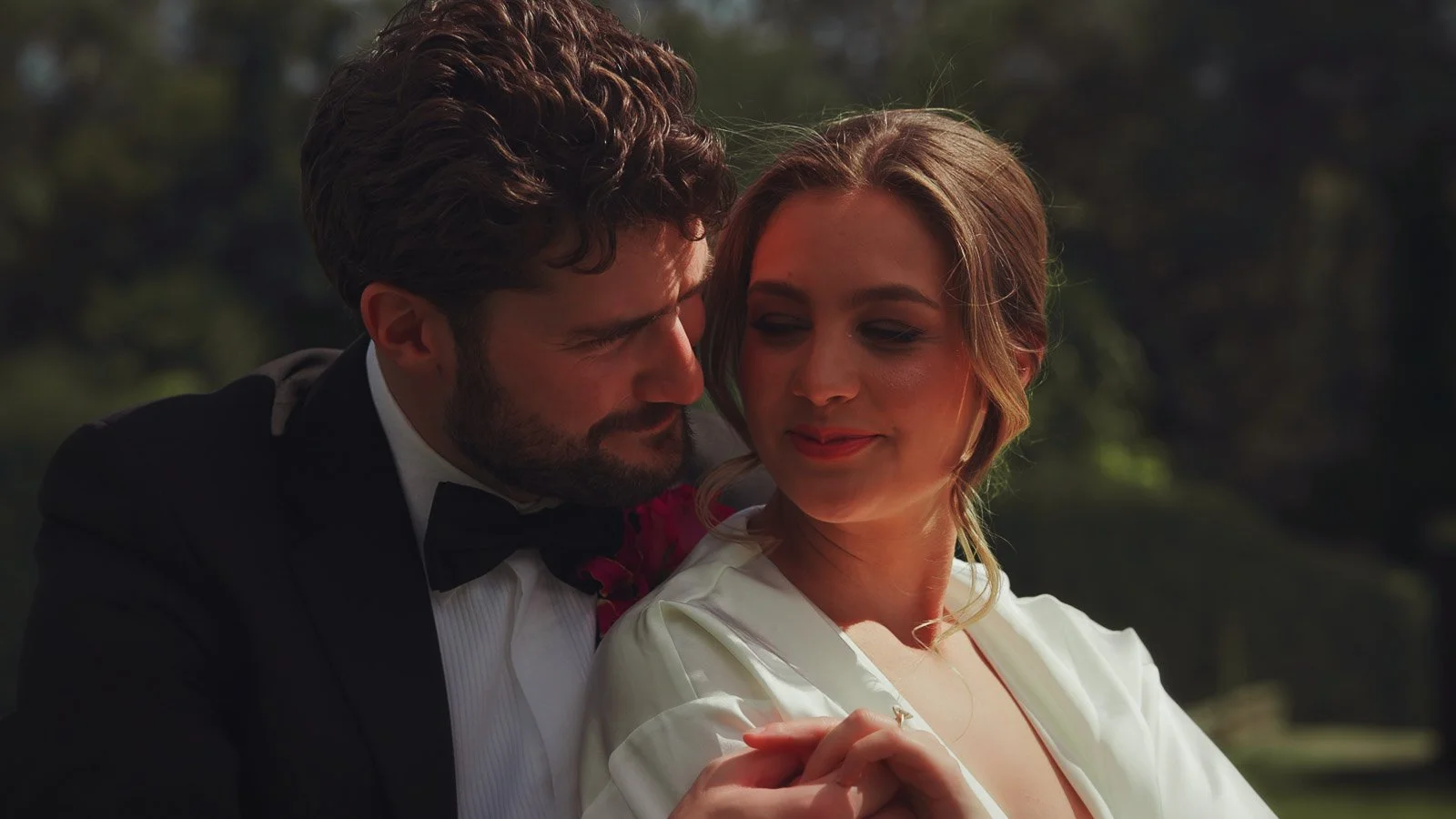
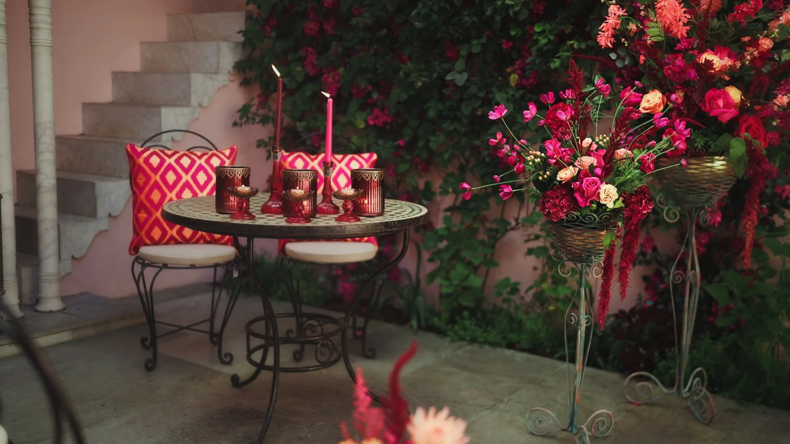
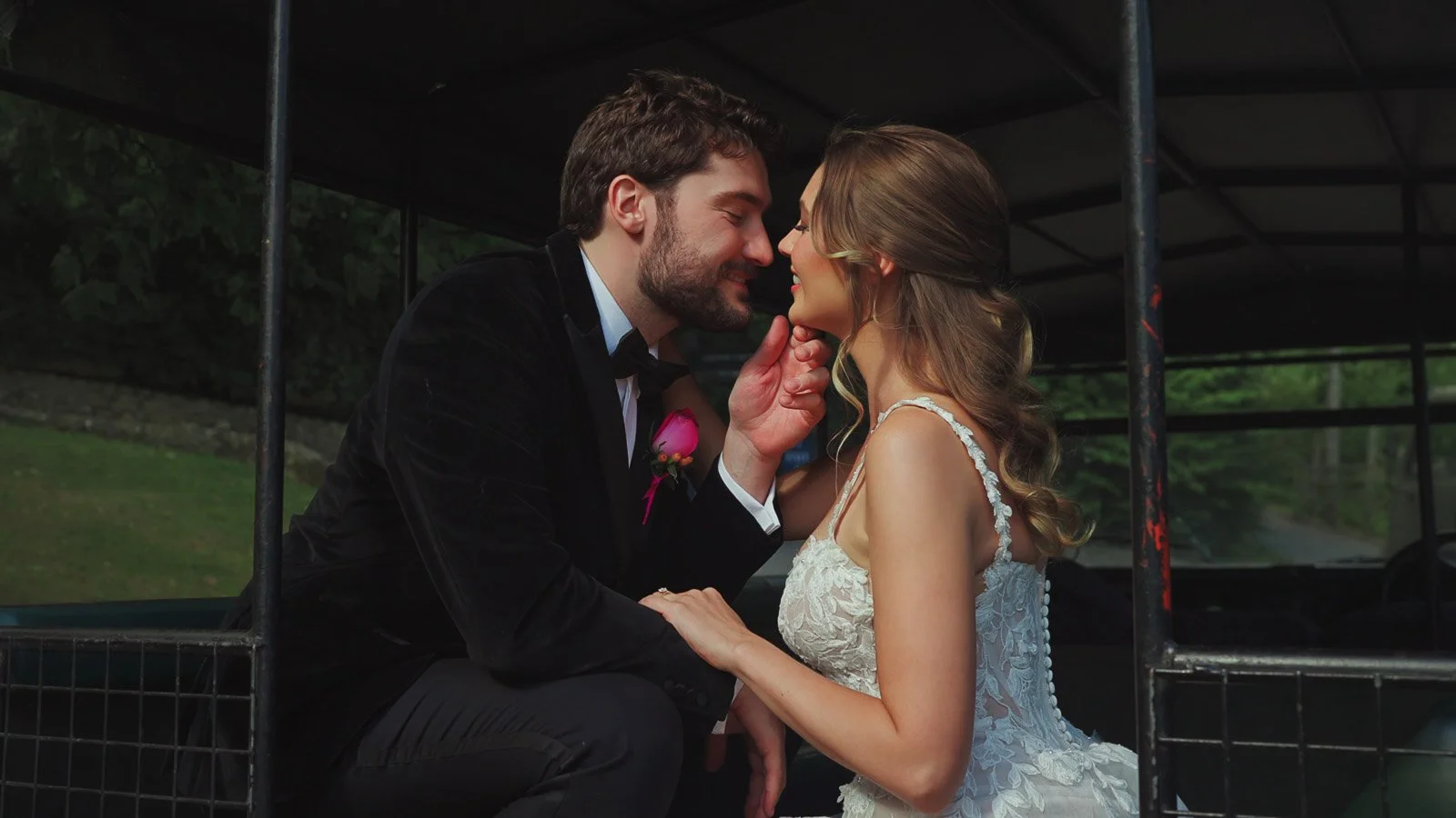
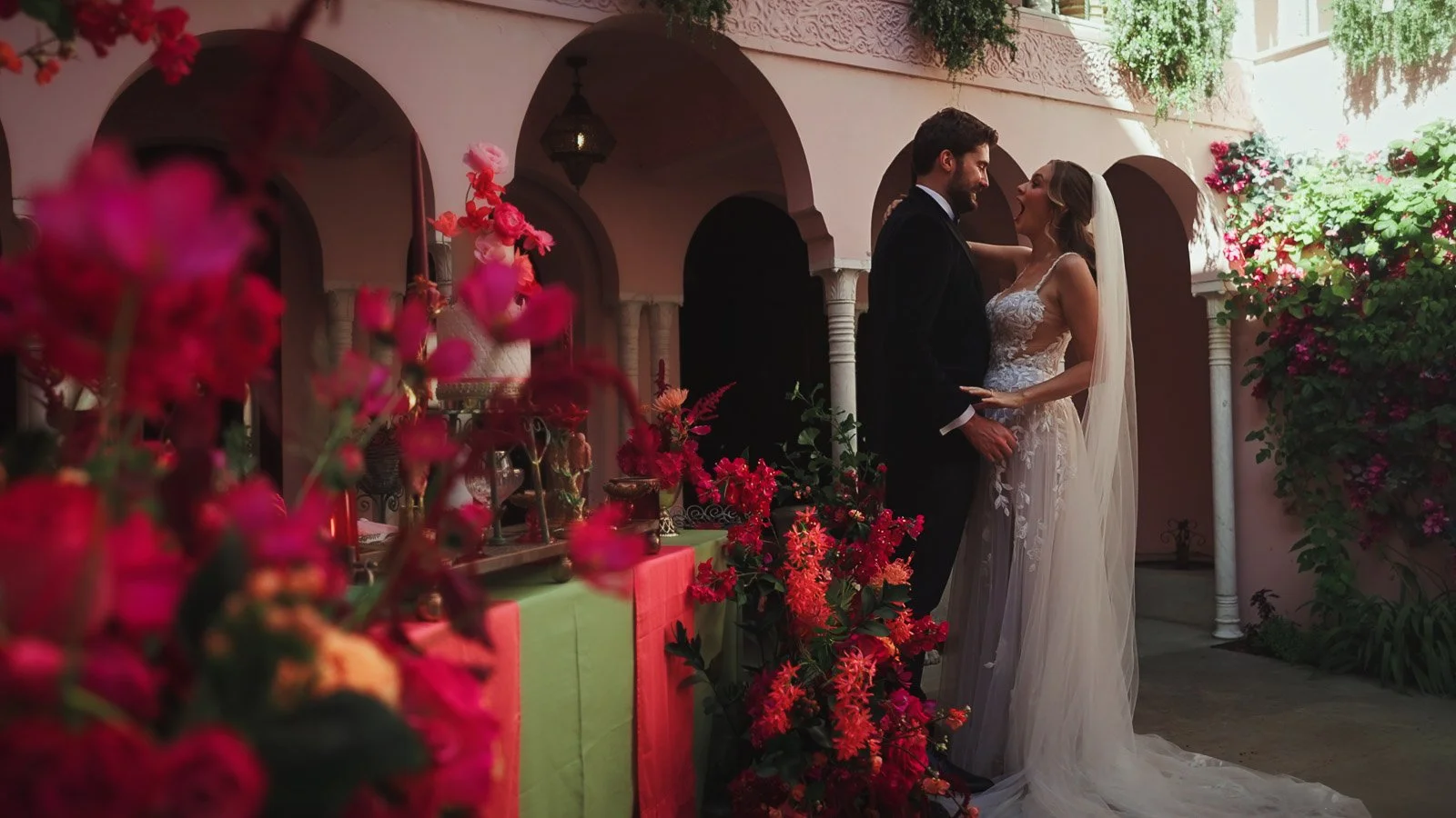
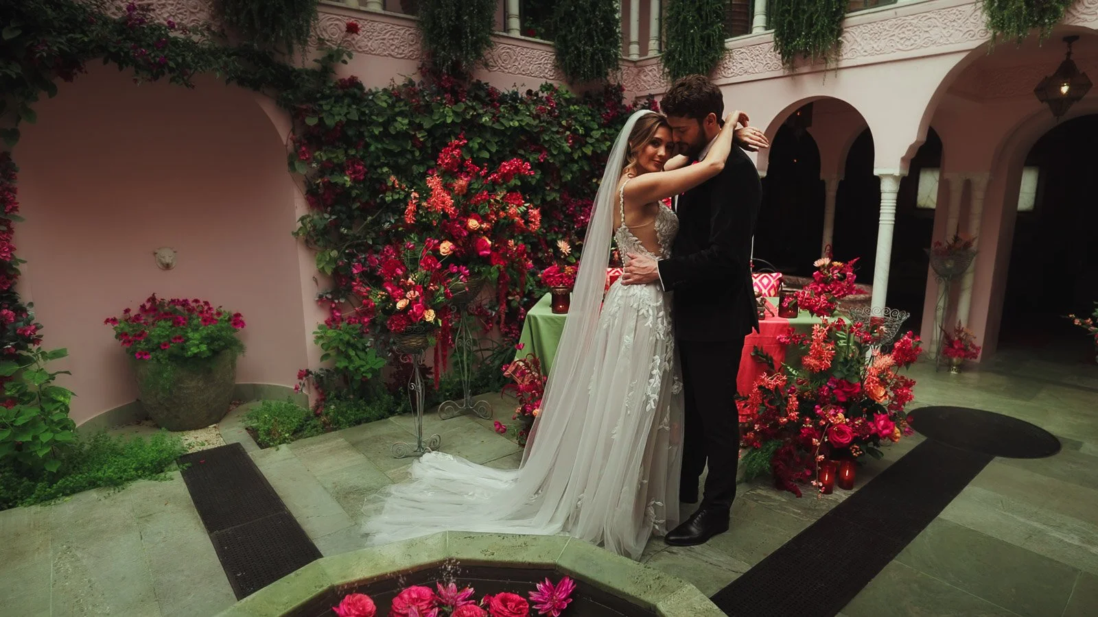
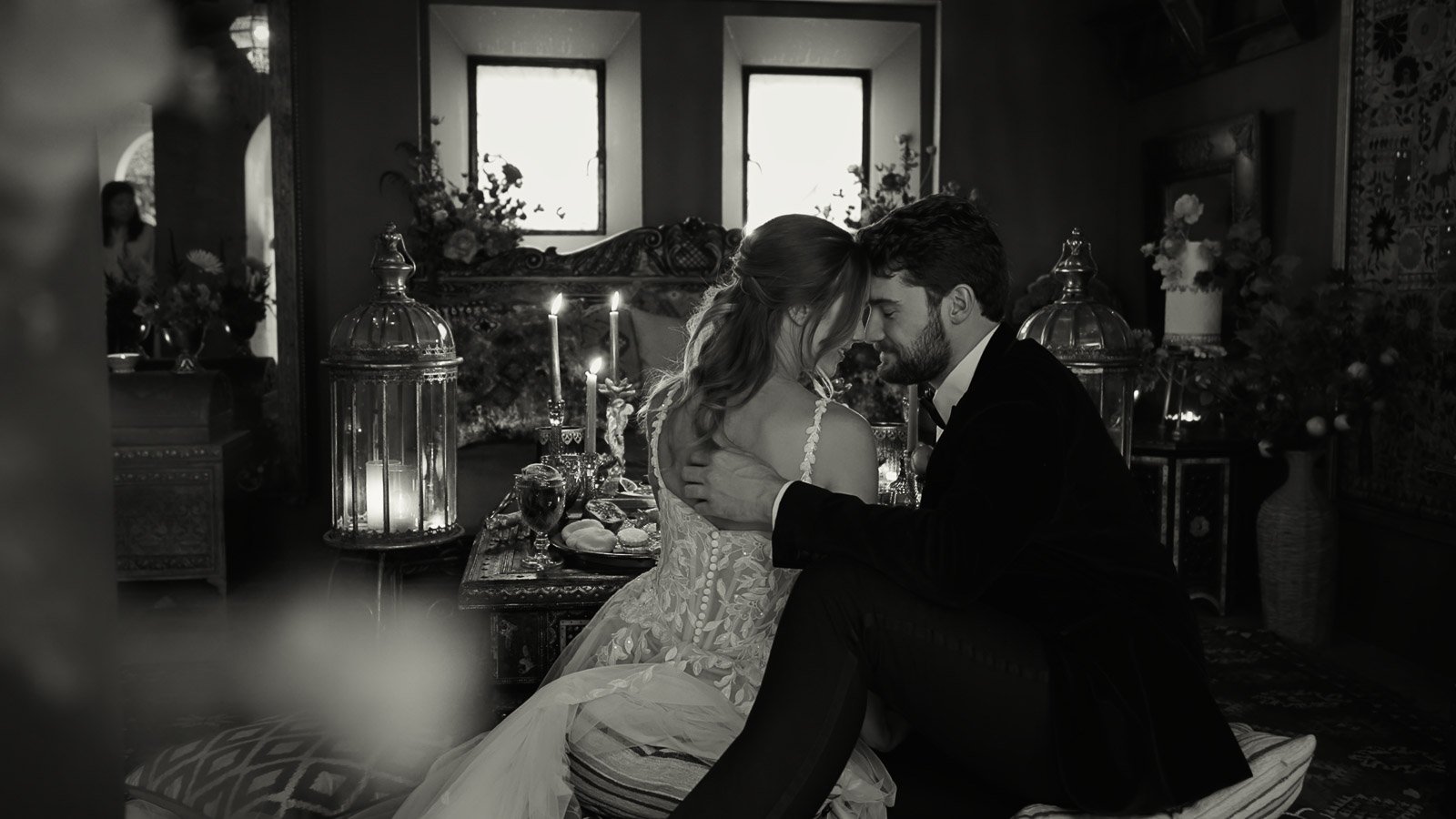
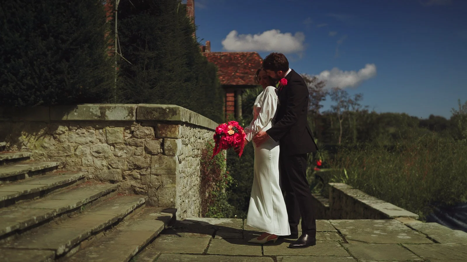
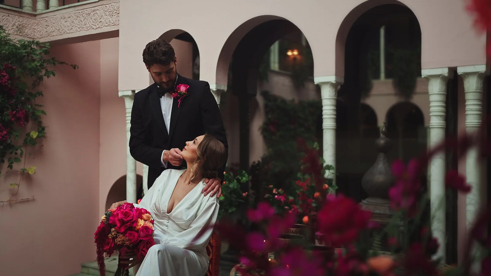
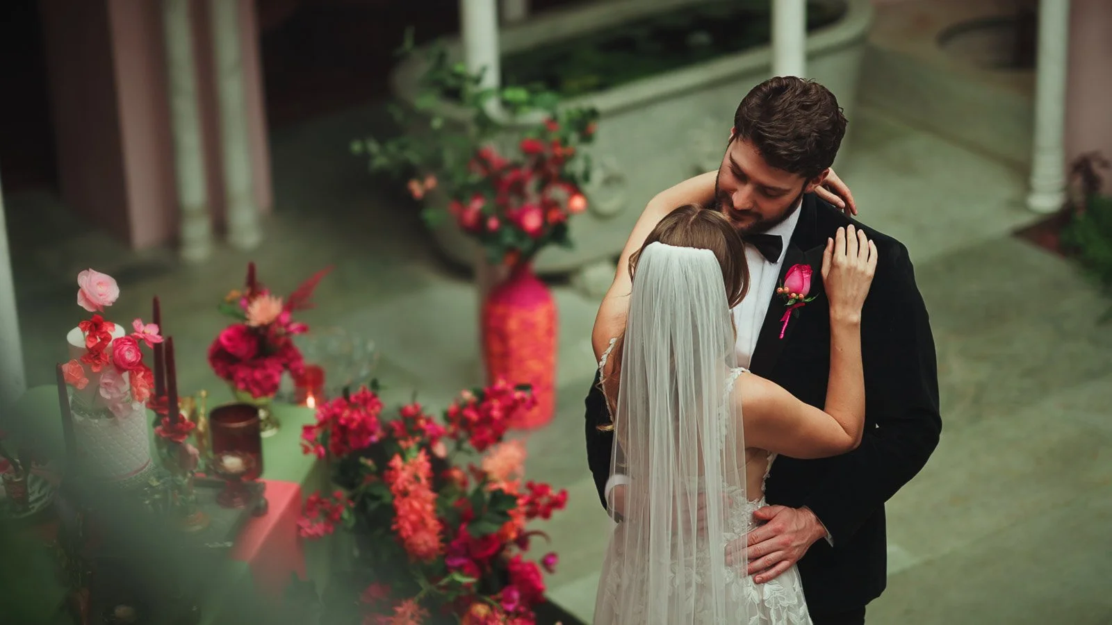
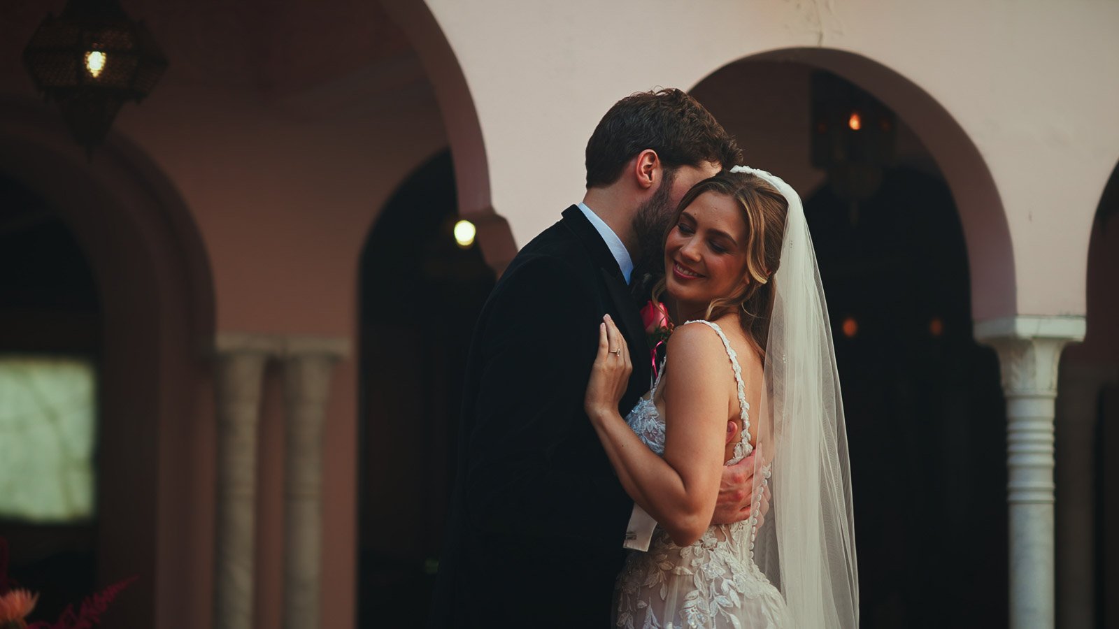
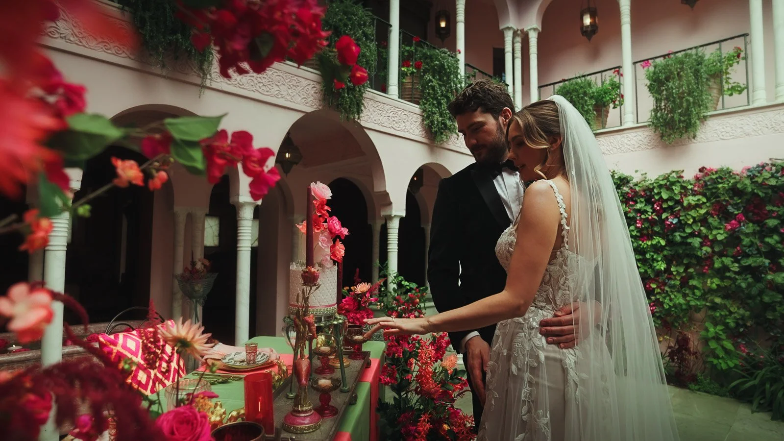
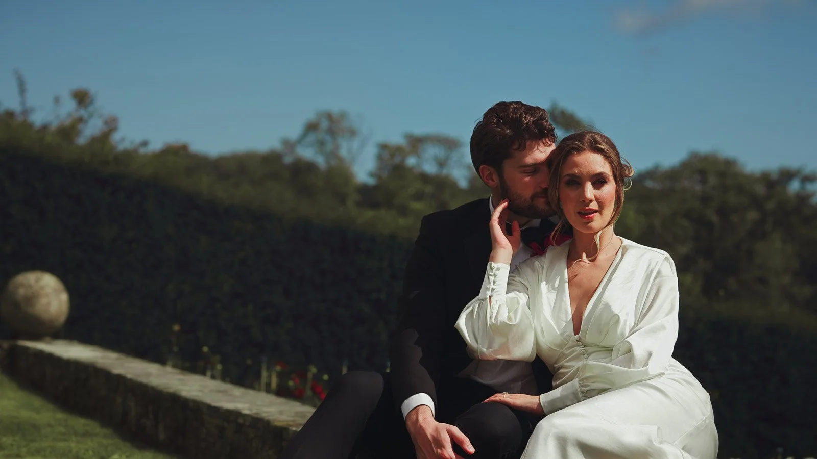
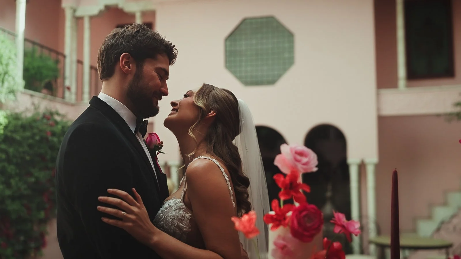
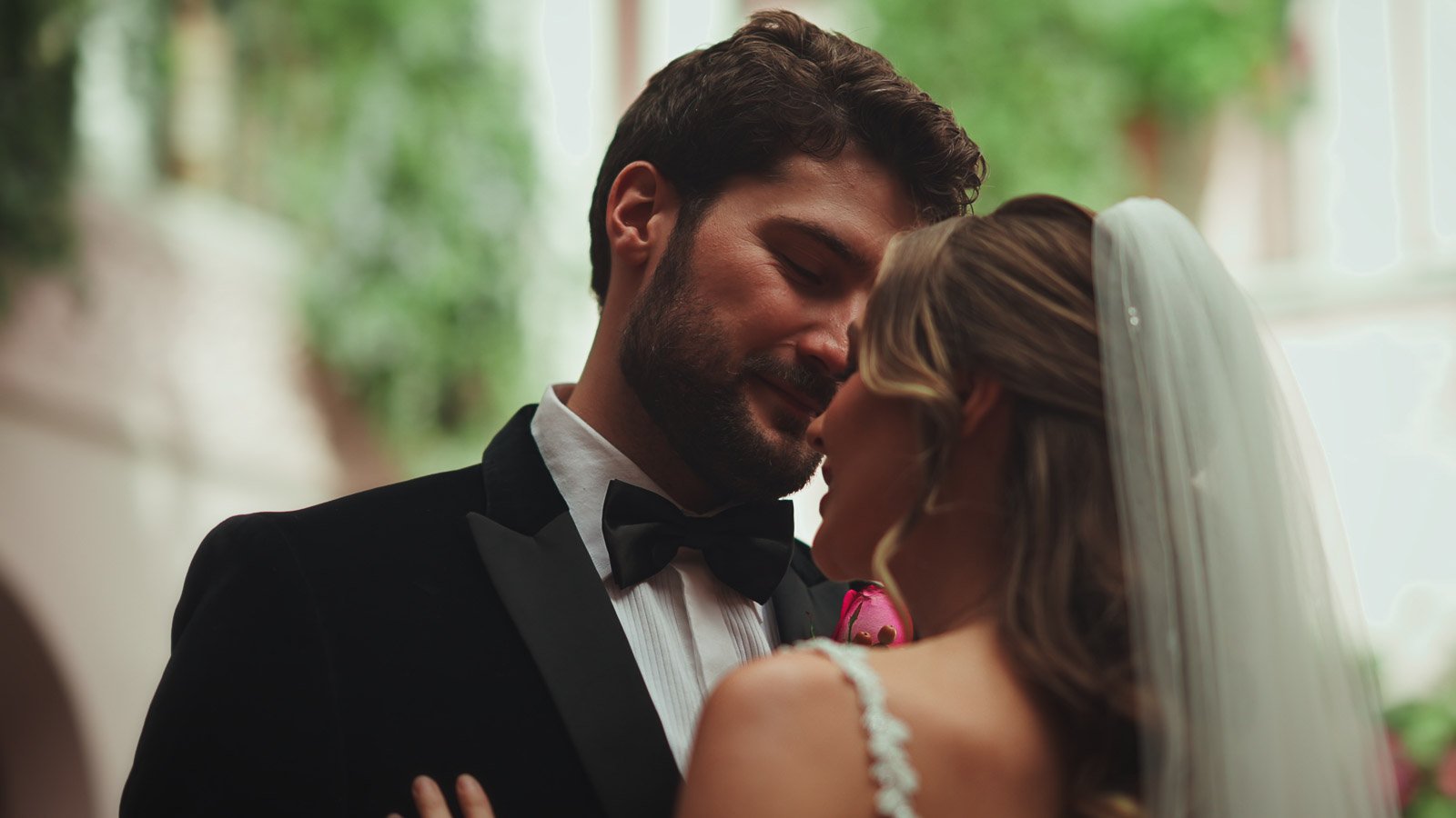
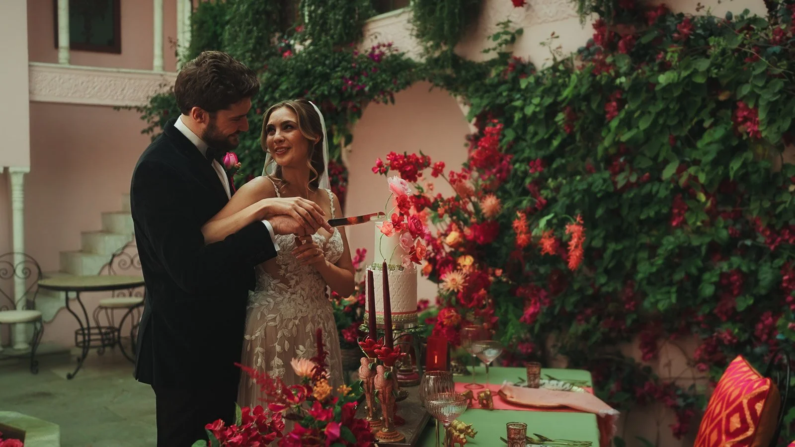
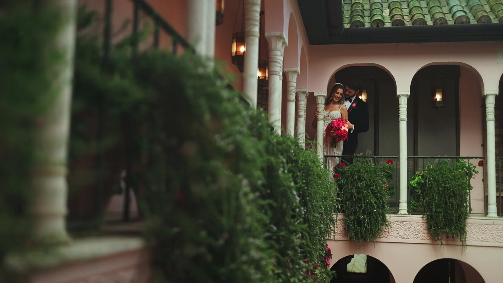
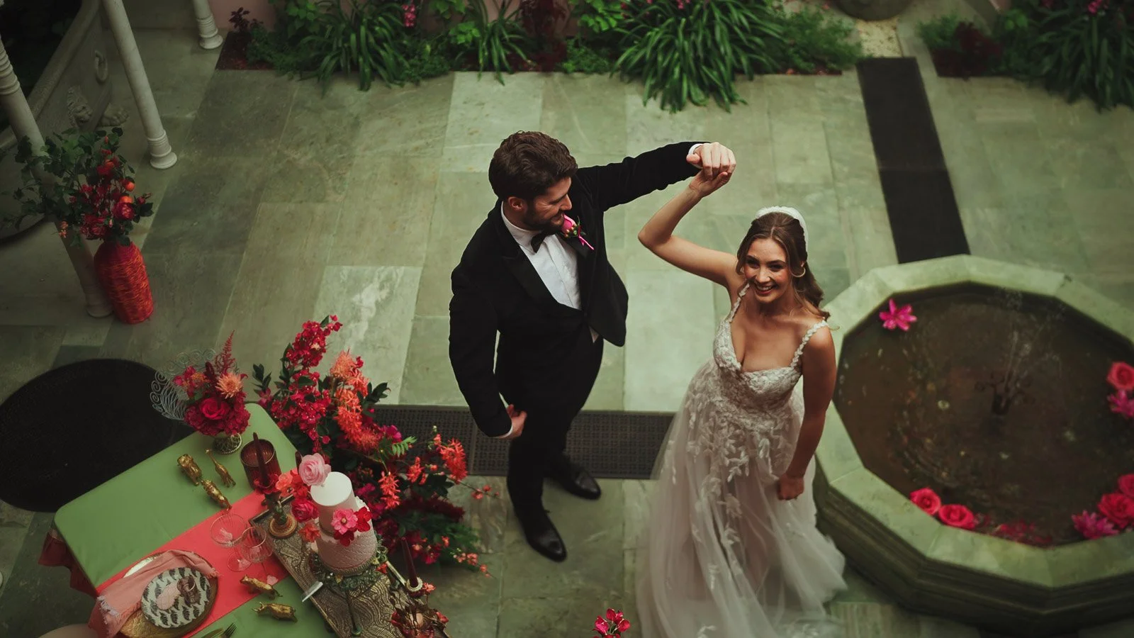
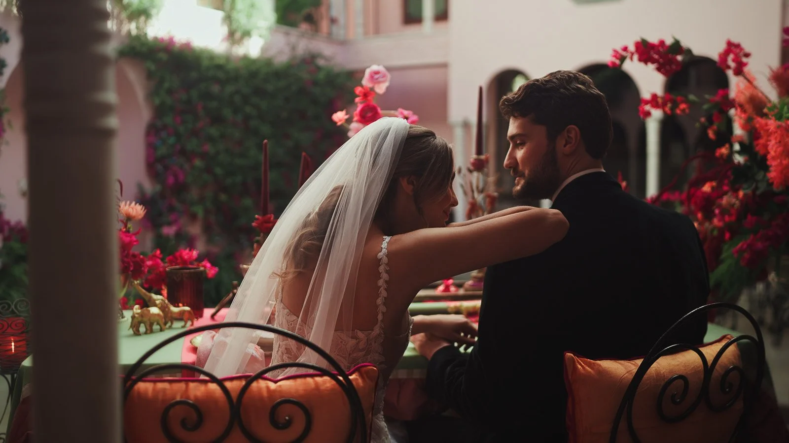
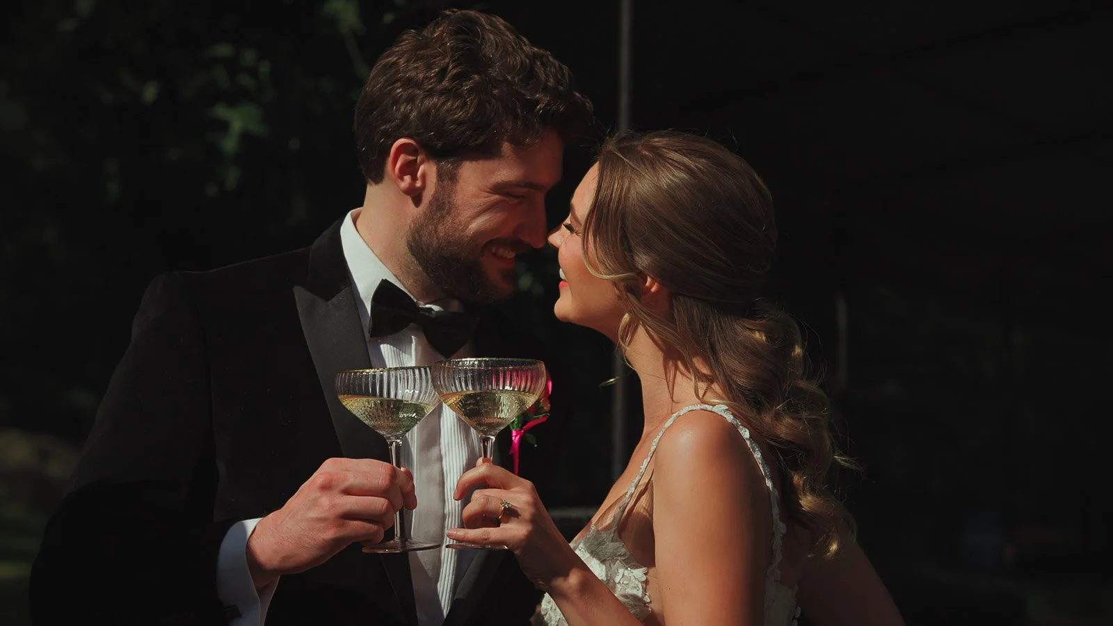
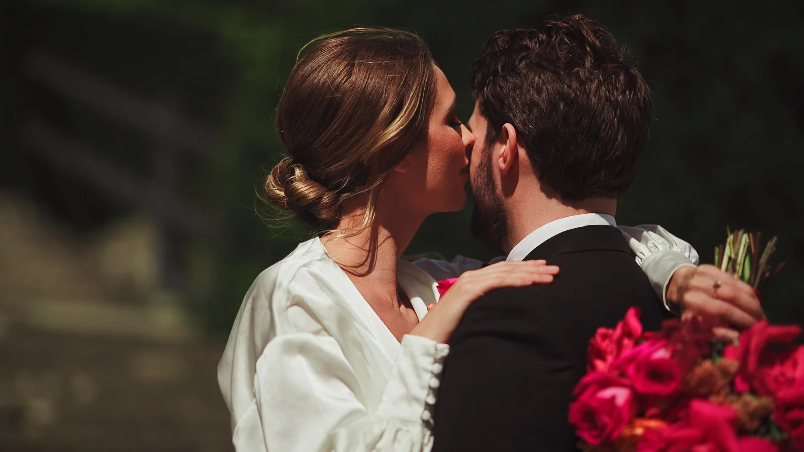
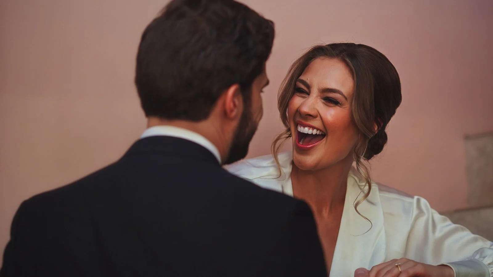
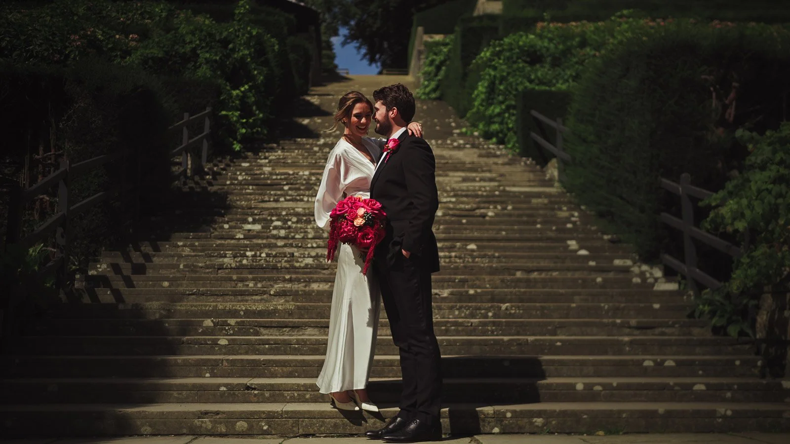
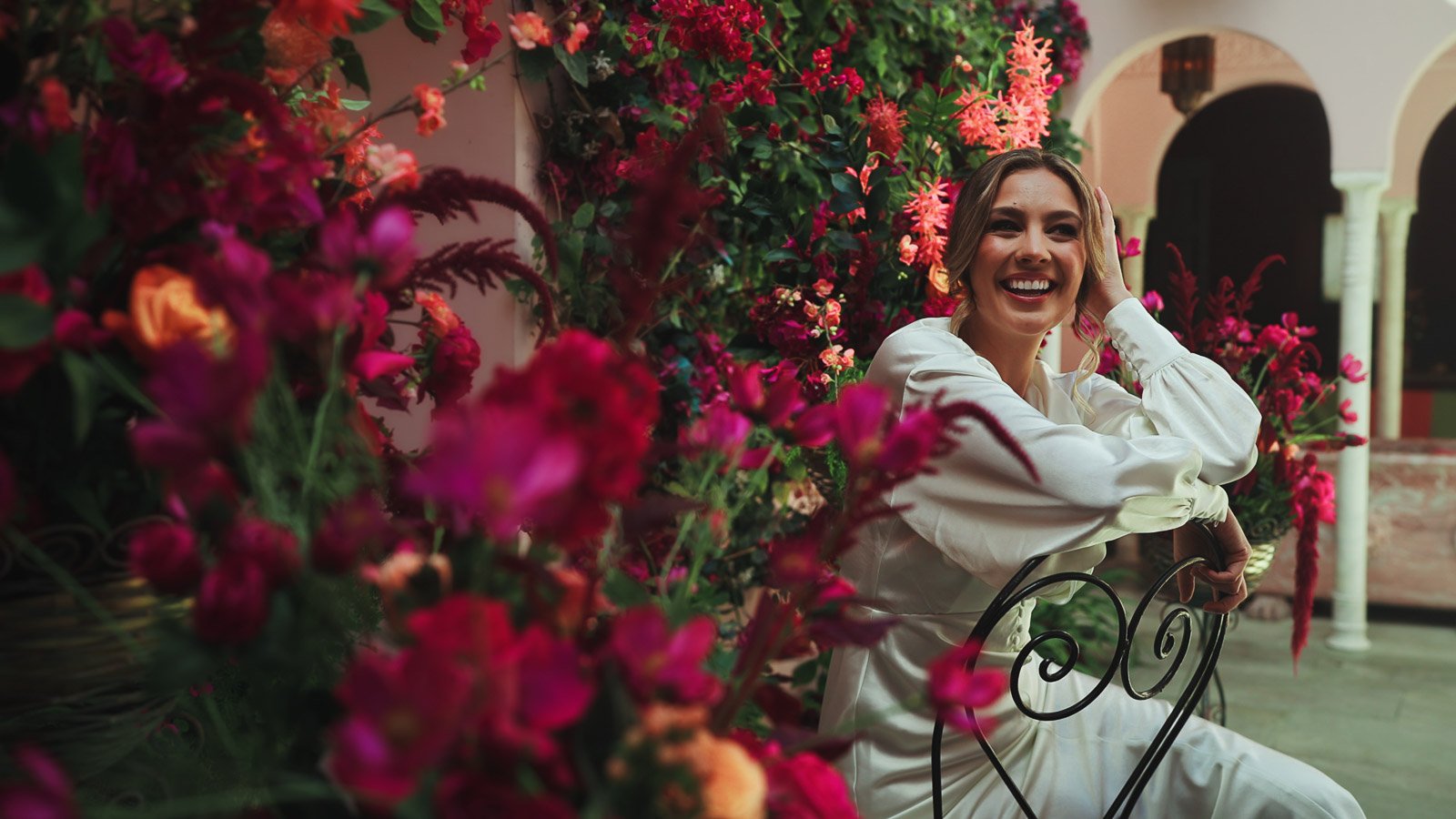
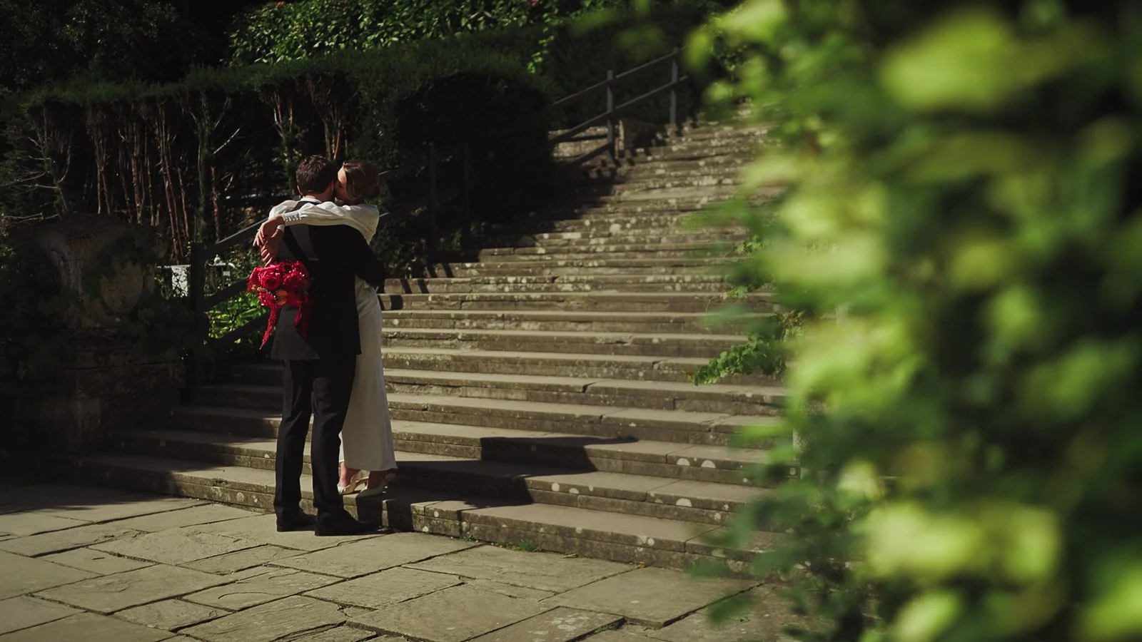
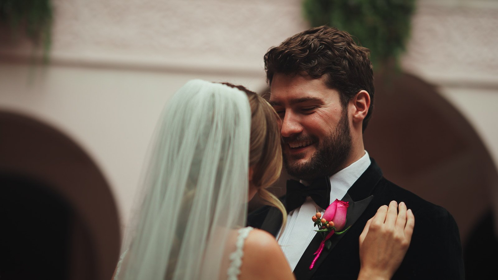
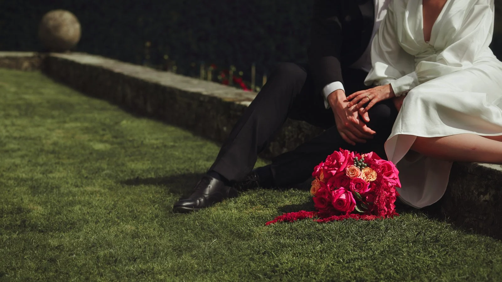
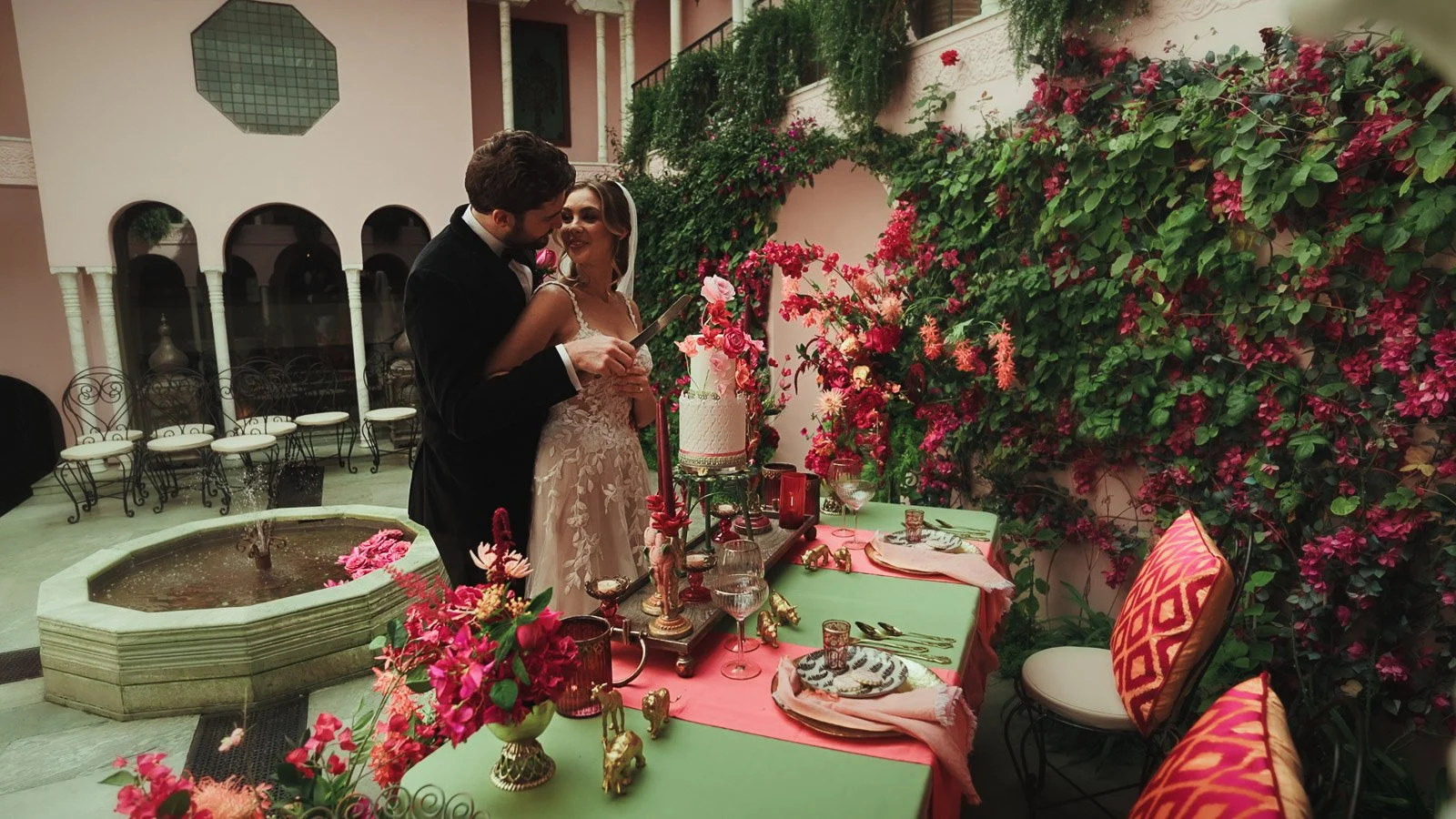
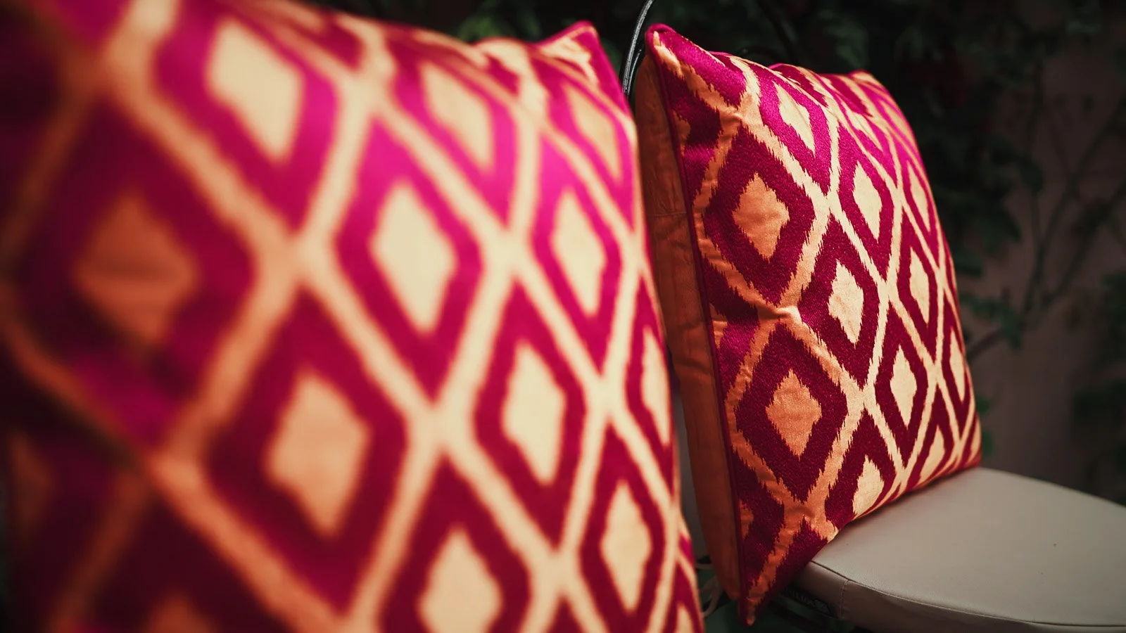
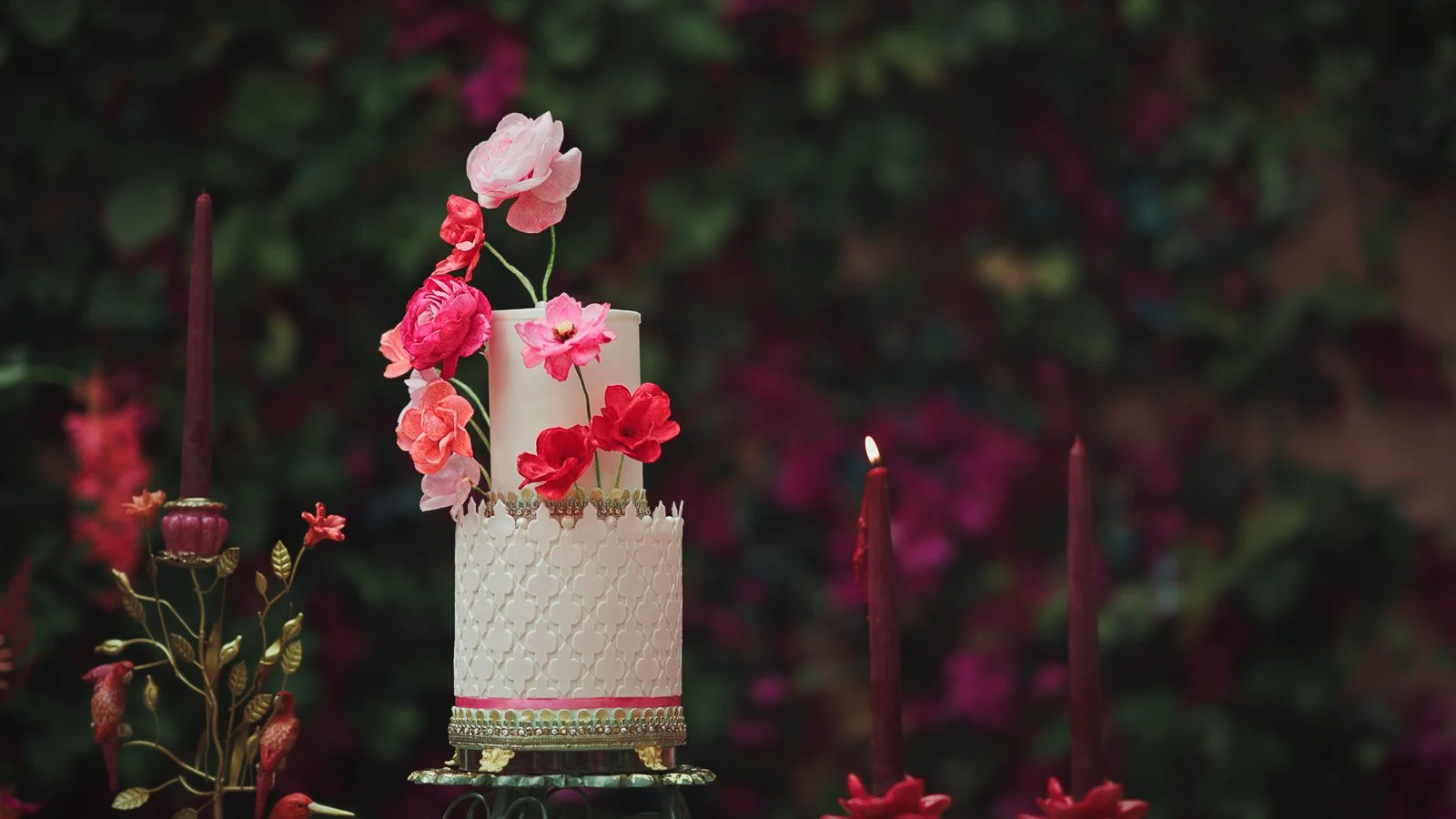
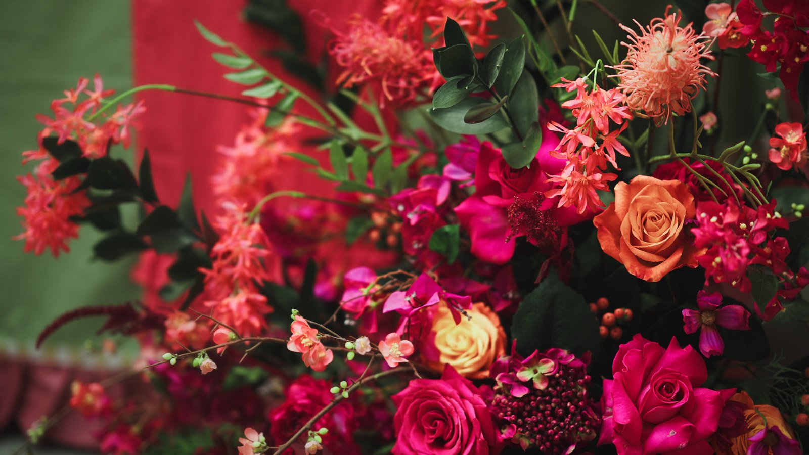
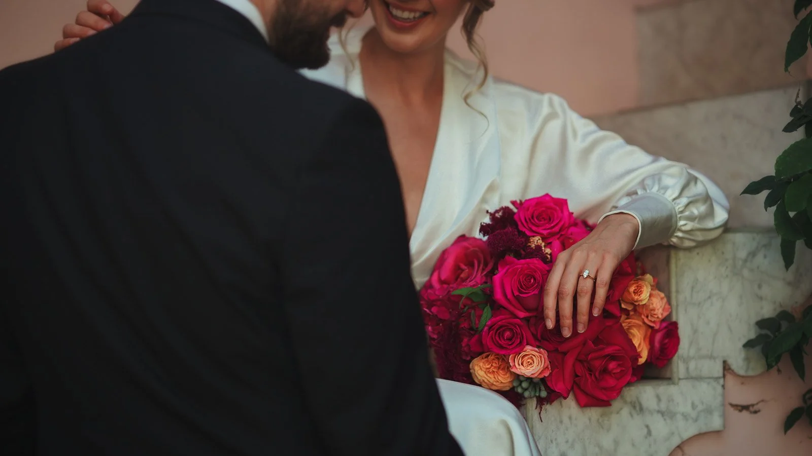
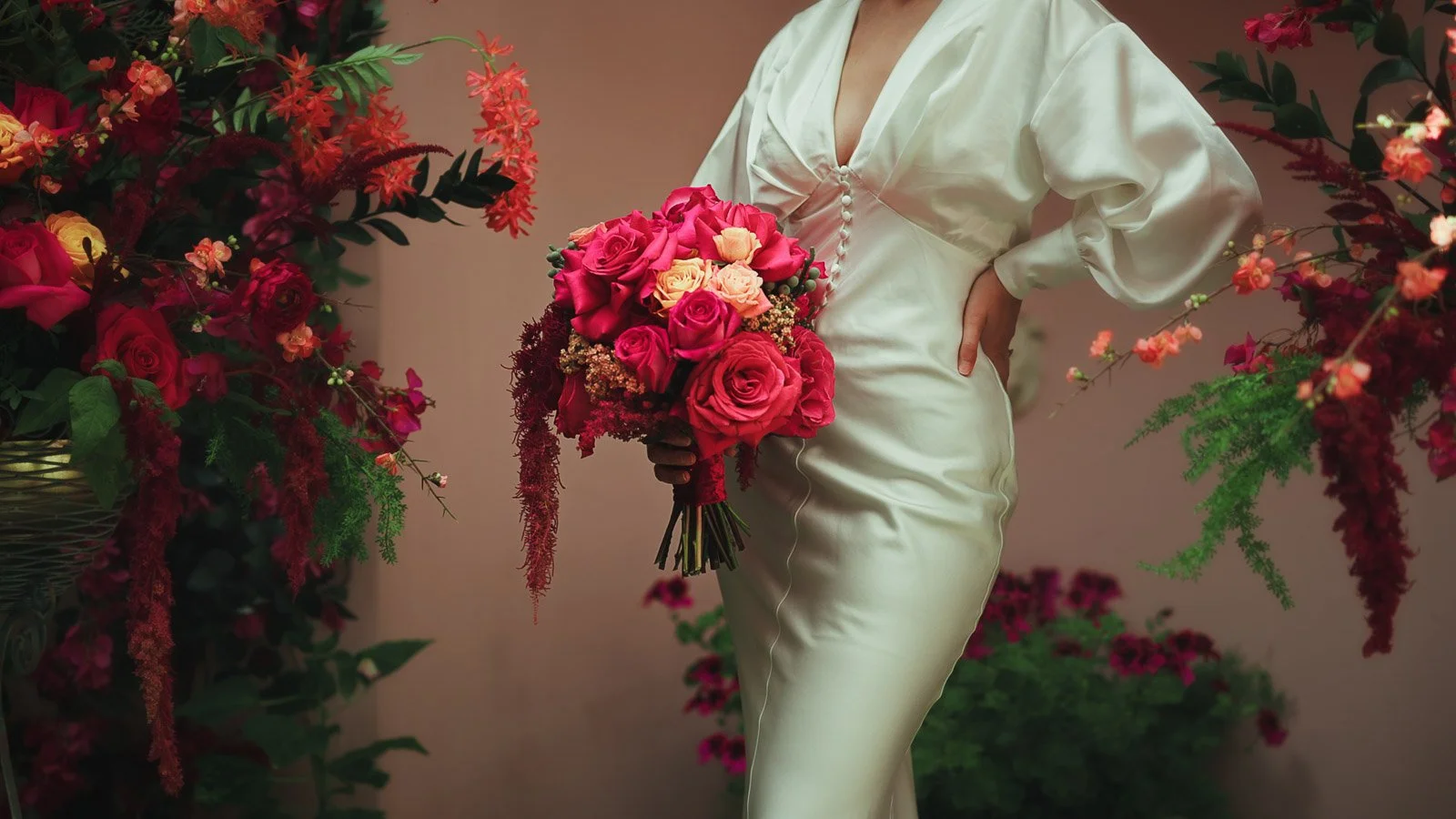
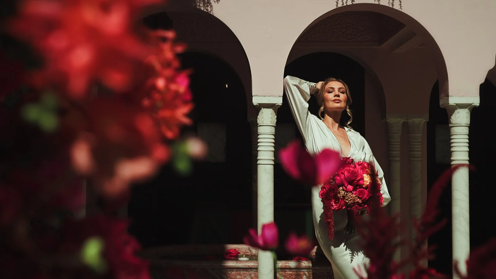
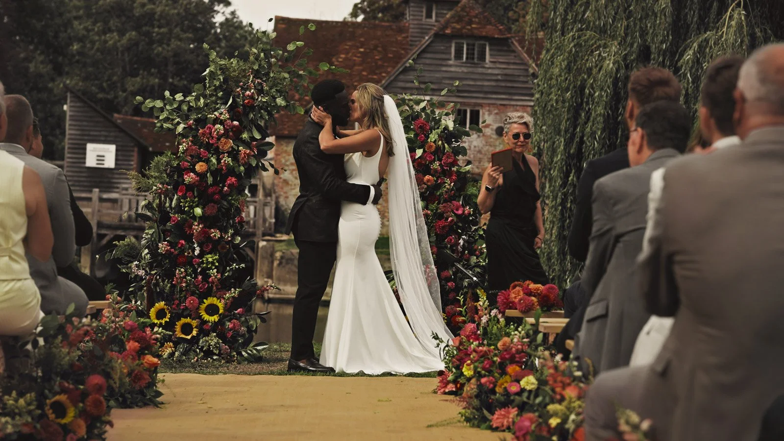
A real example — bold pinks and reds, filmed with restraint
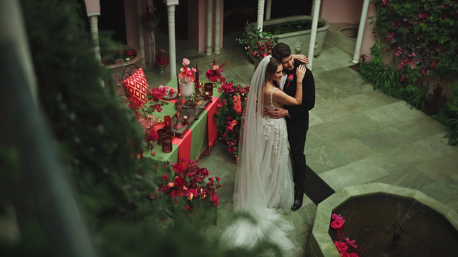
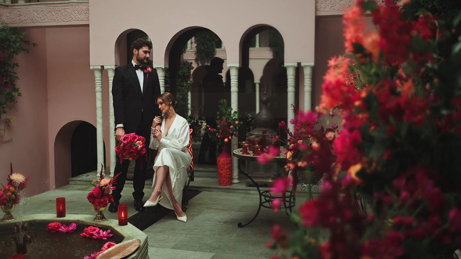
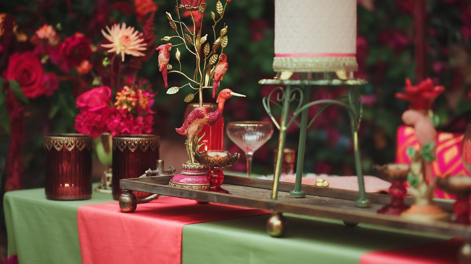
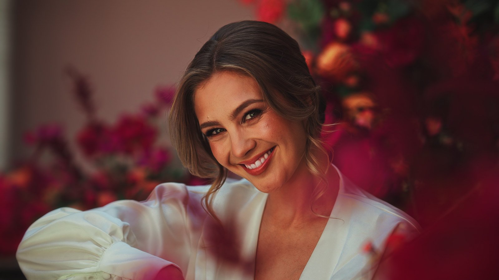
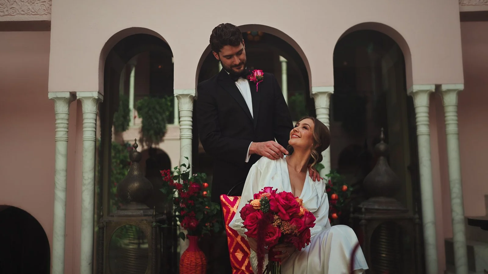
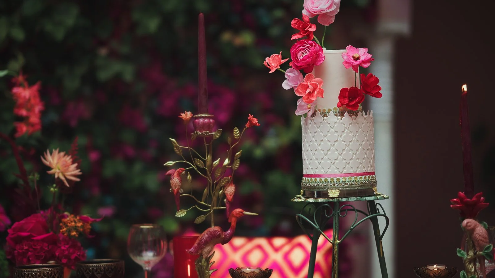
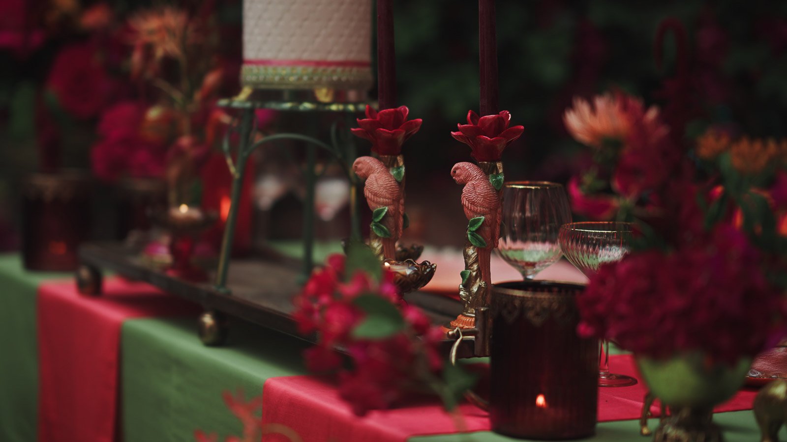
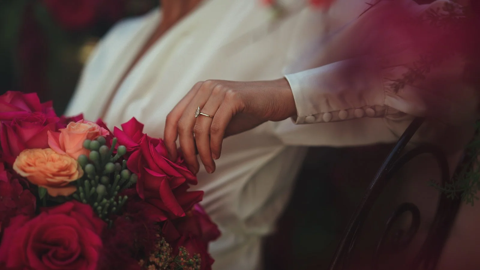
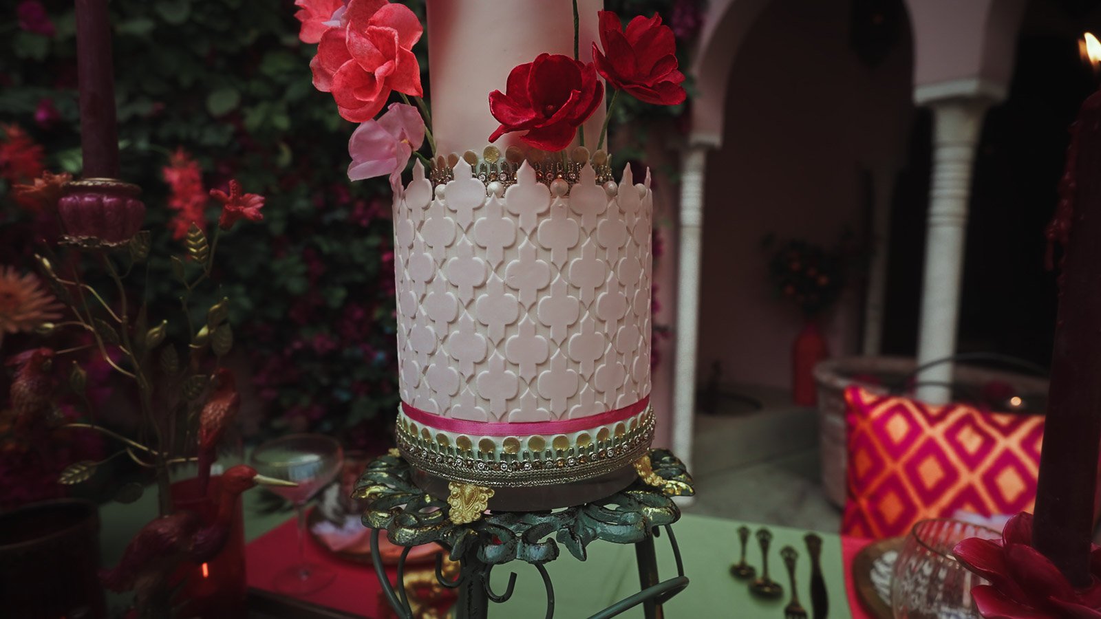
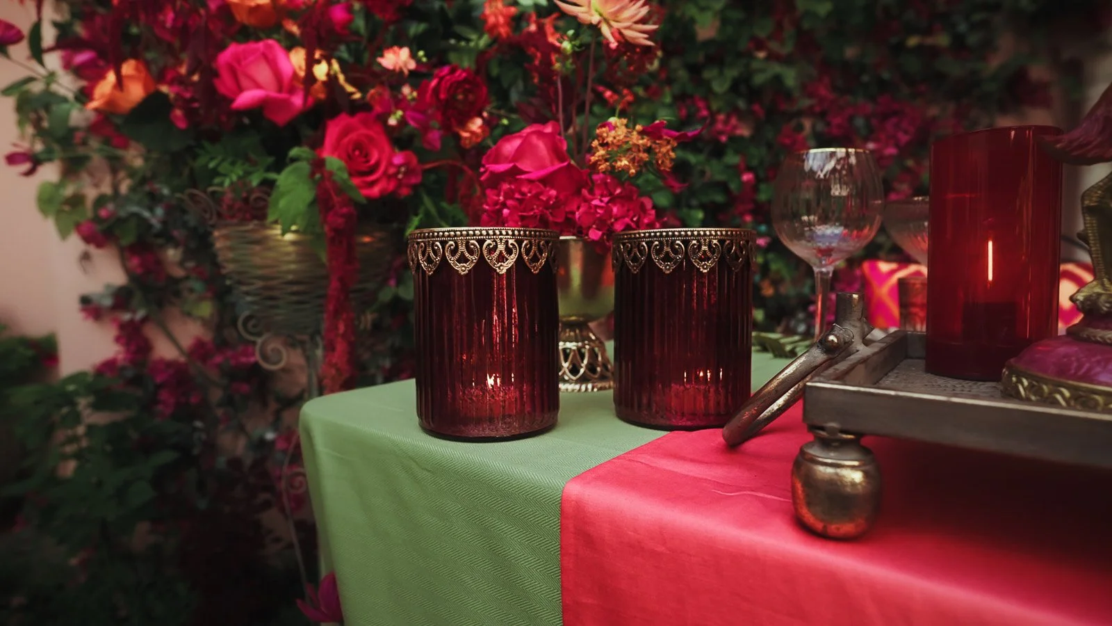
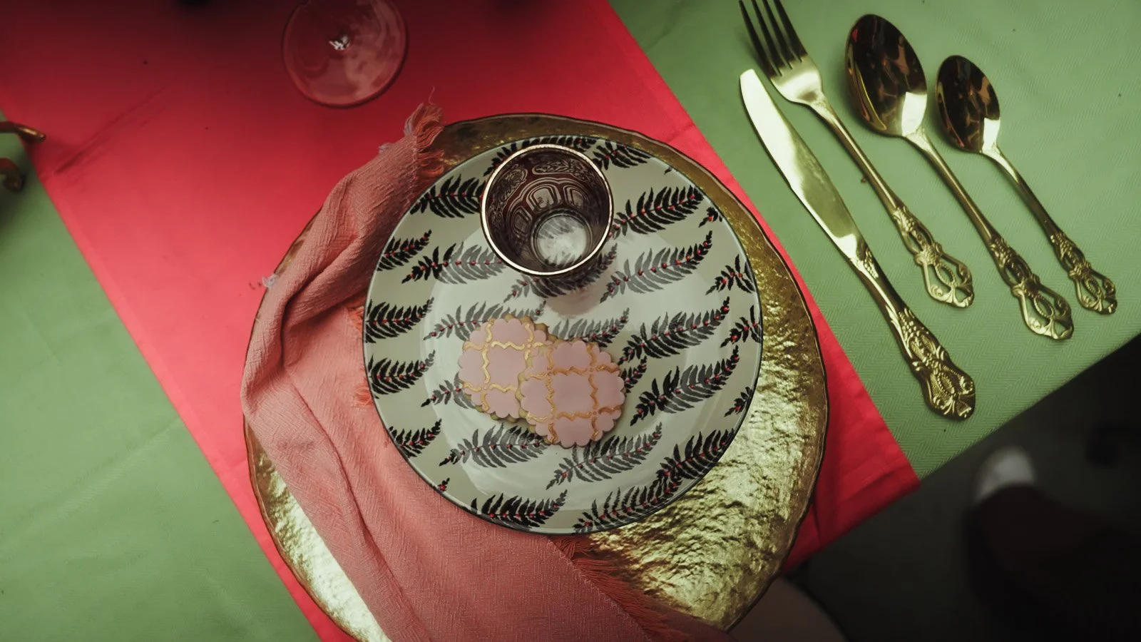
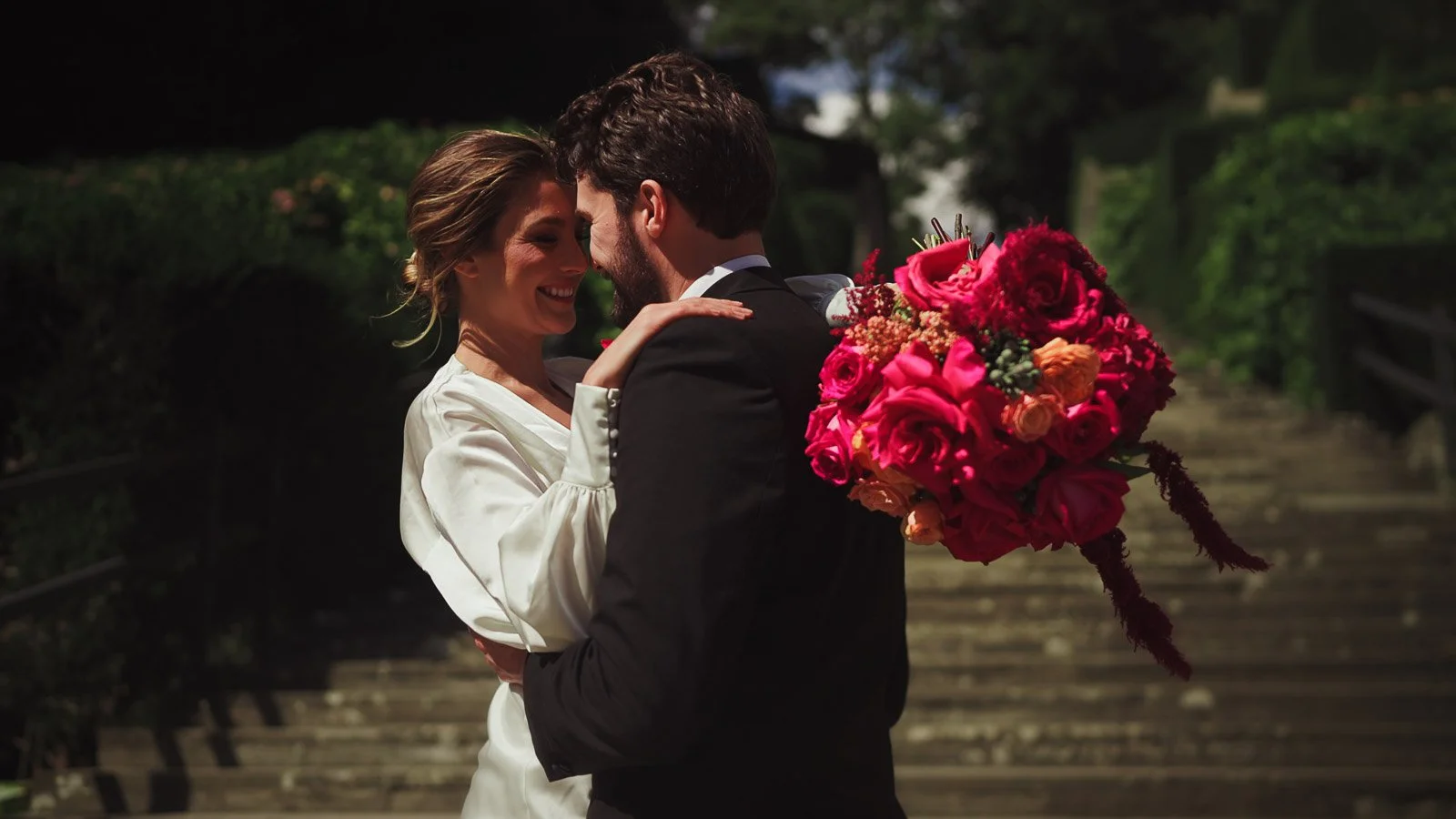
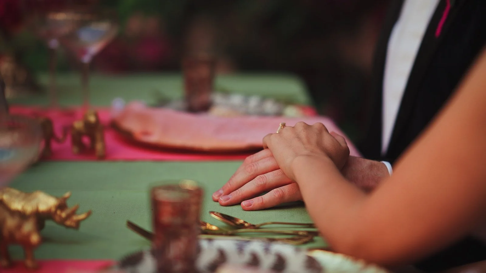
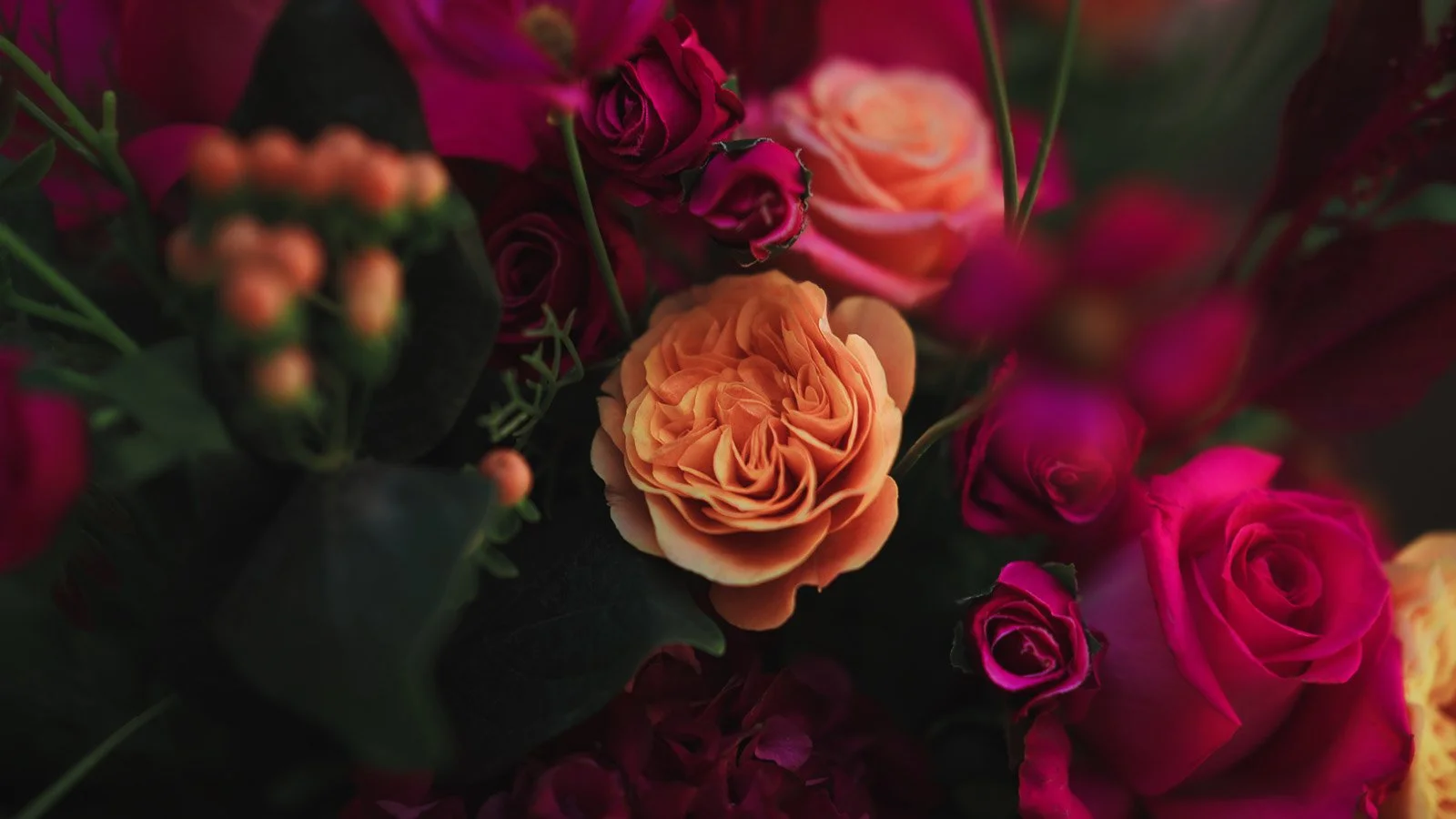
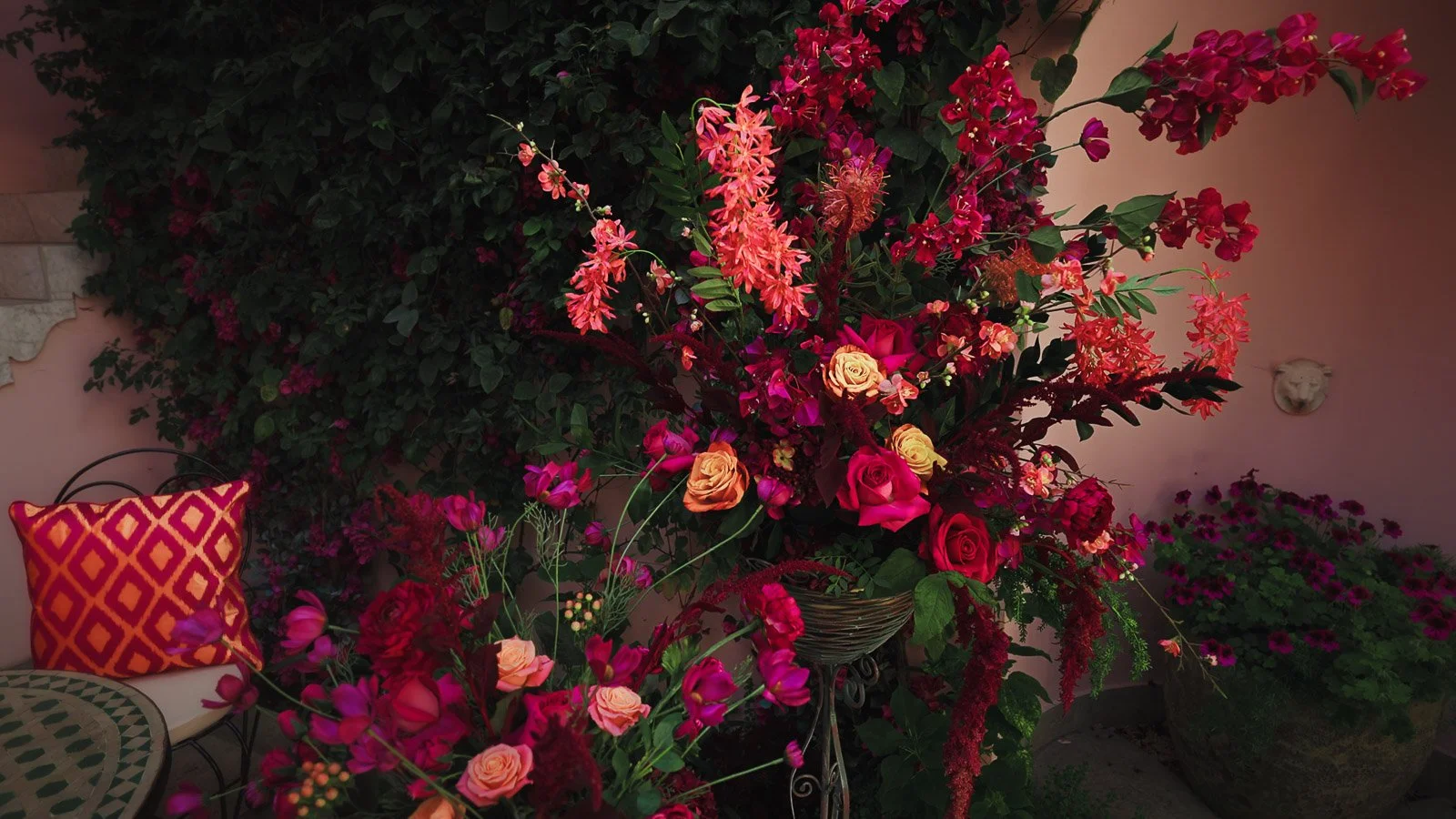
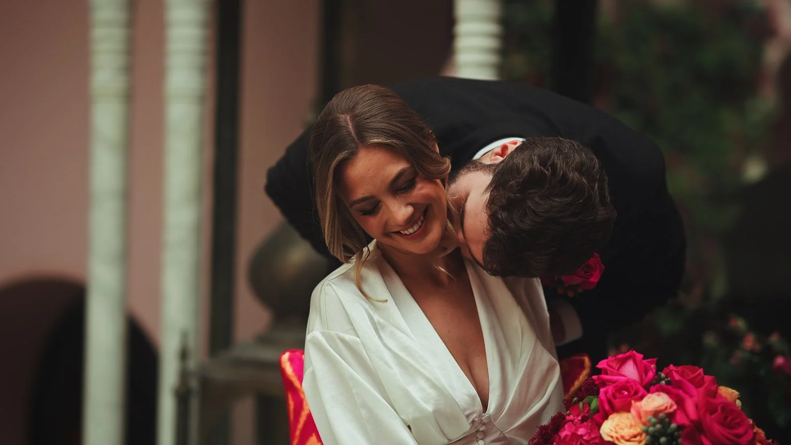
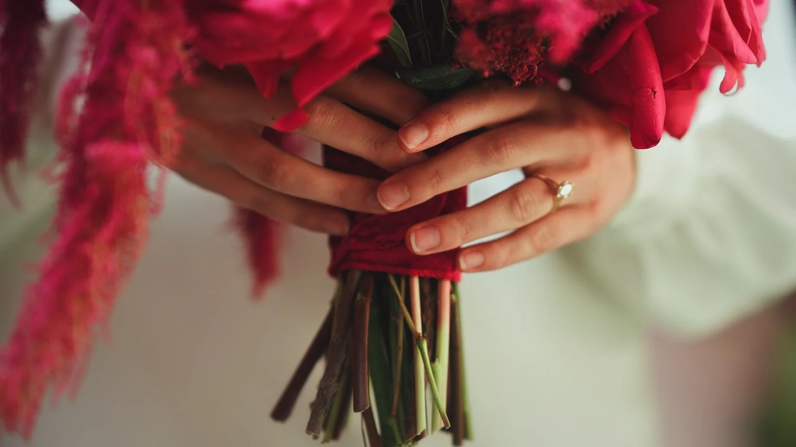
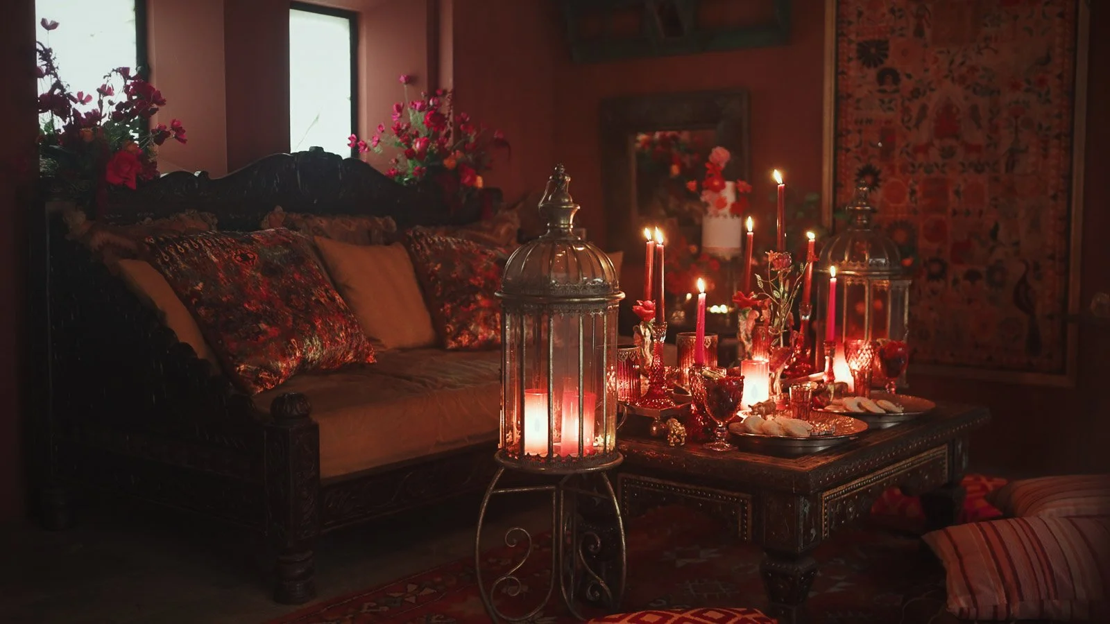
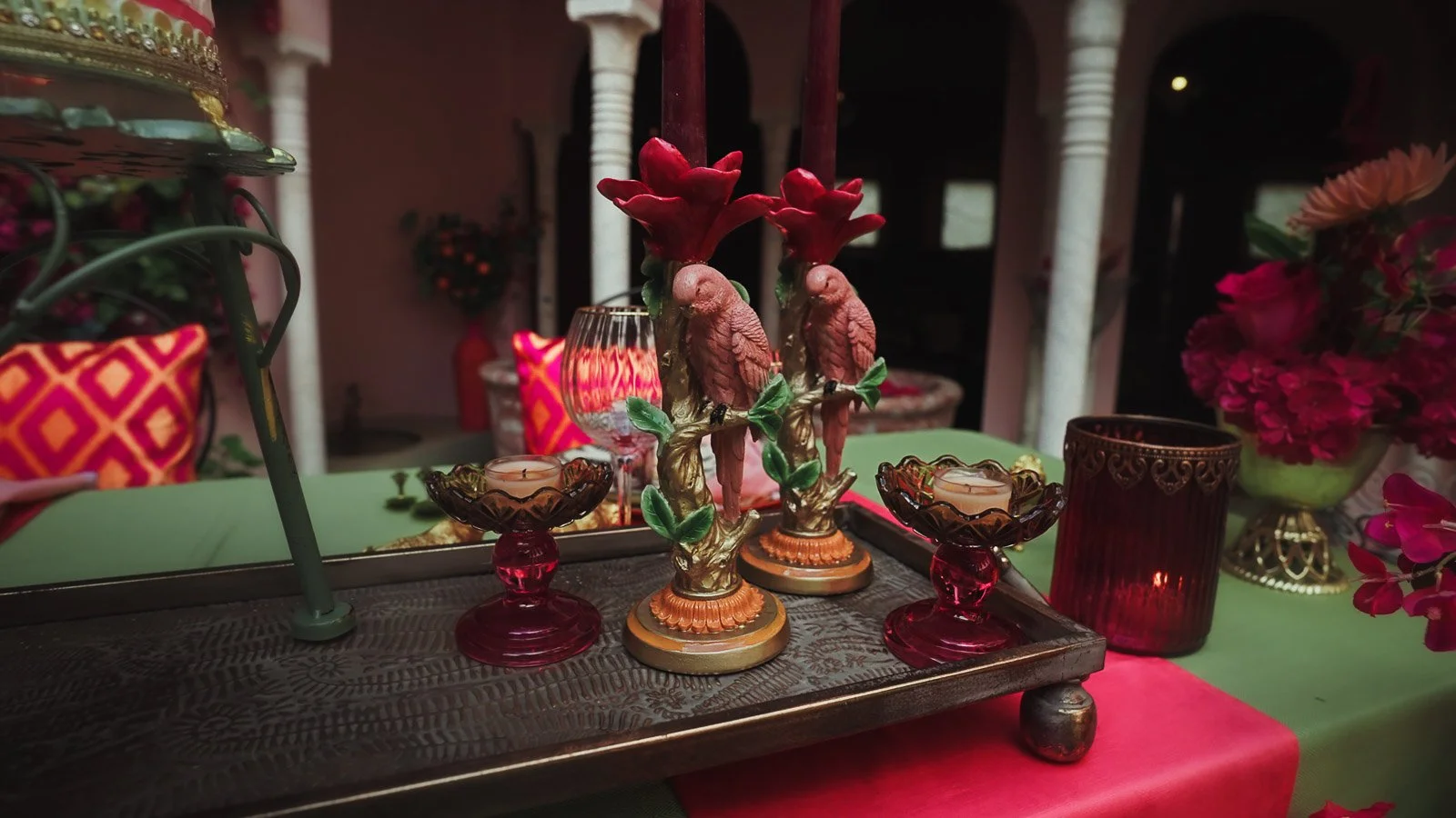
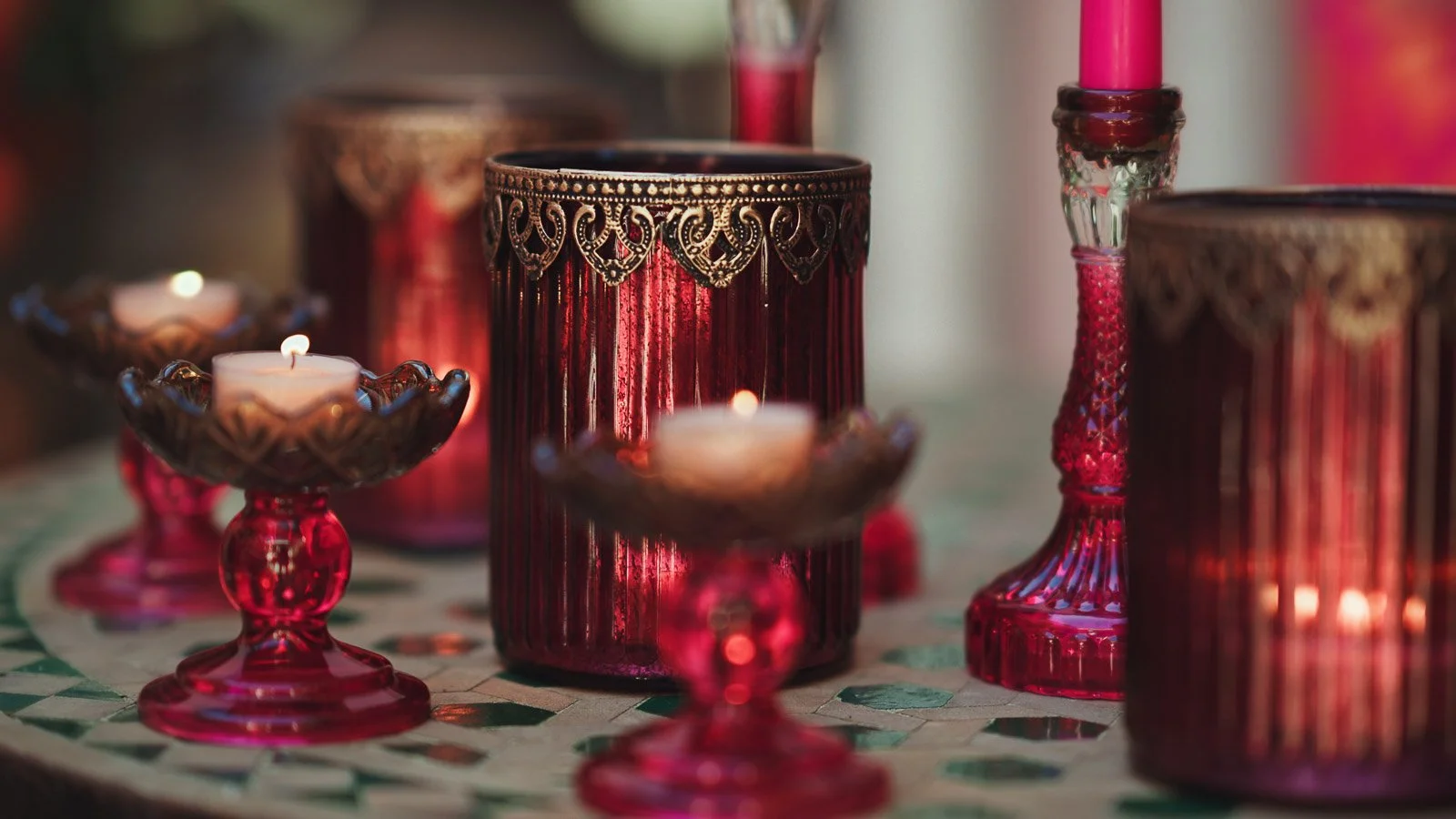
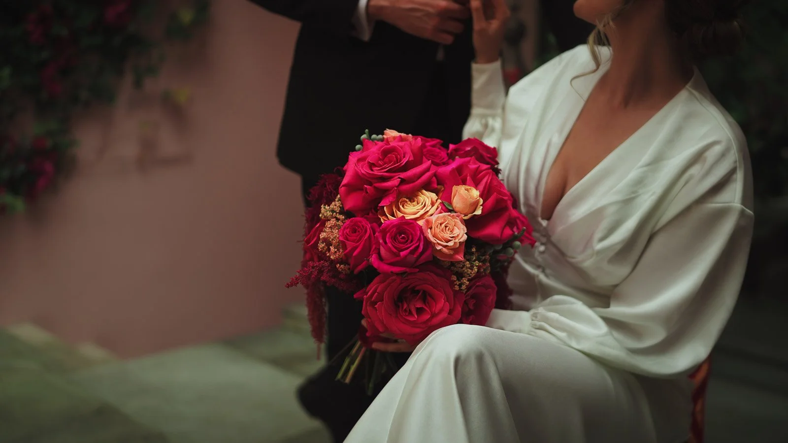
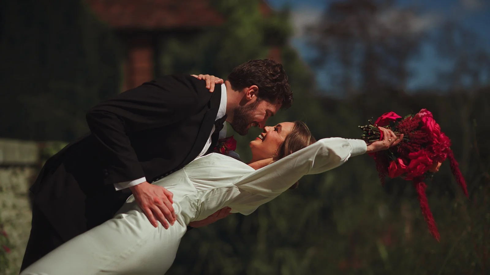
This styled shoot was built around an unapologetic pink and red palette, paired with a formal black-tie foundation. The design didn’t rely on colour everywhere. Instead, it used intentional focal points: bold floral placements, a refined table scene, and repeated tones that created continuity across multiple setups.
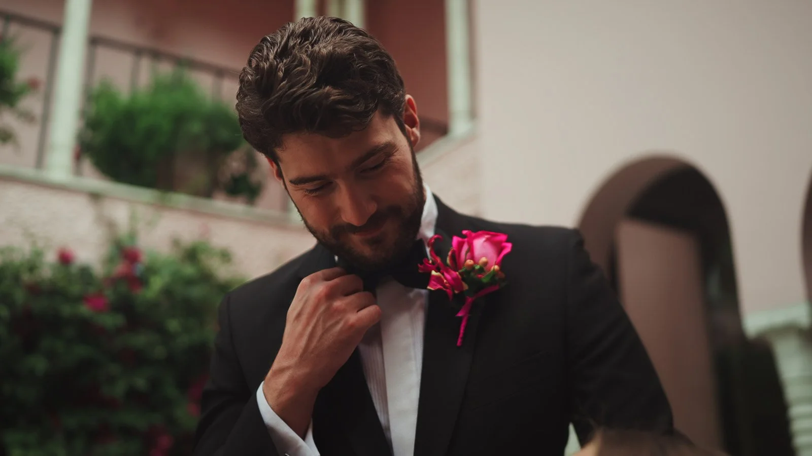
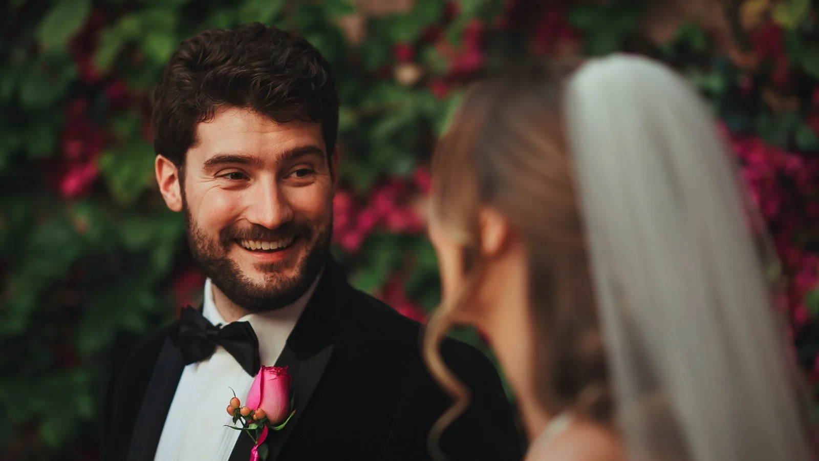
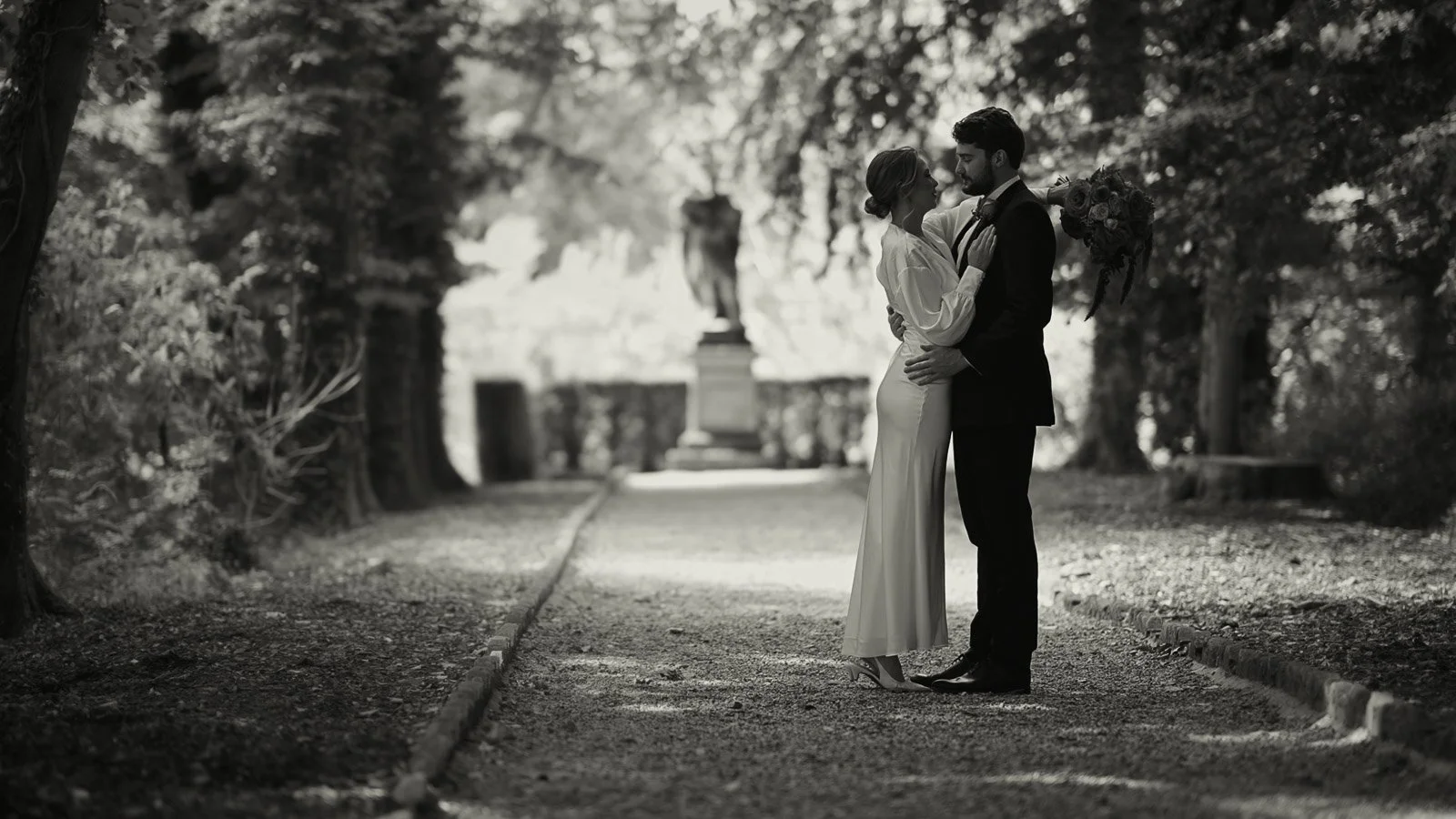
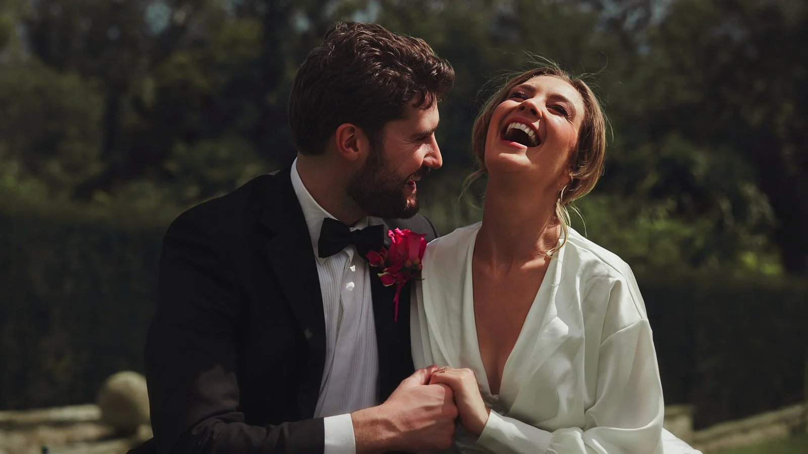
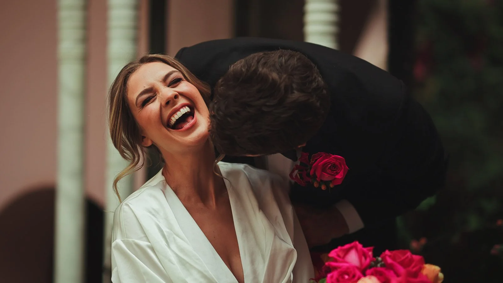
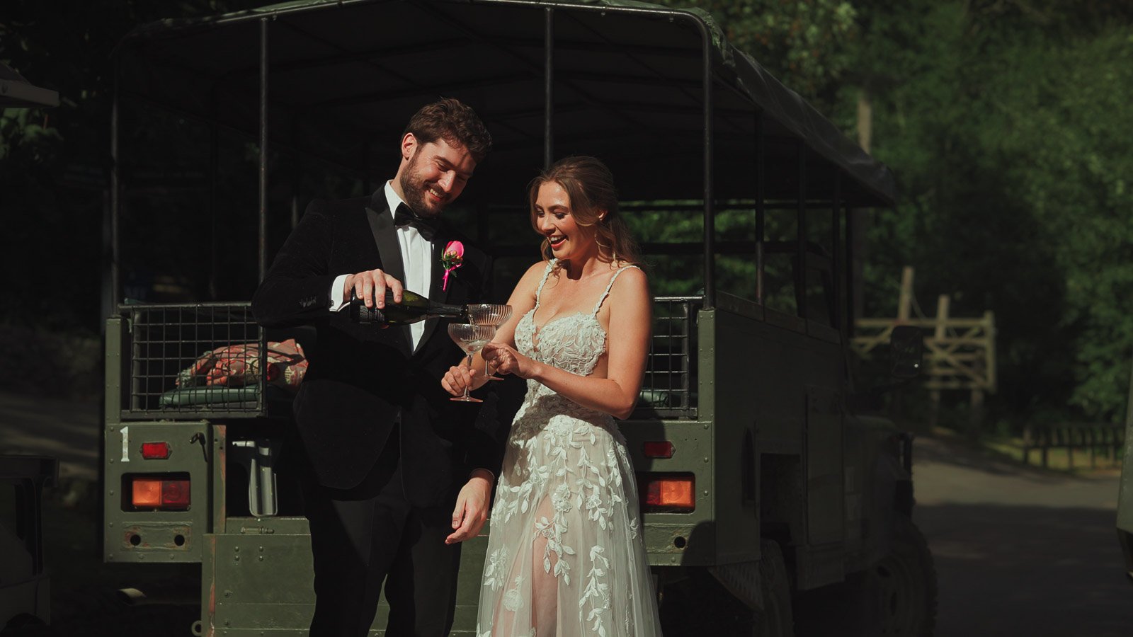
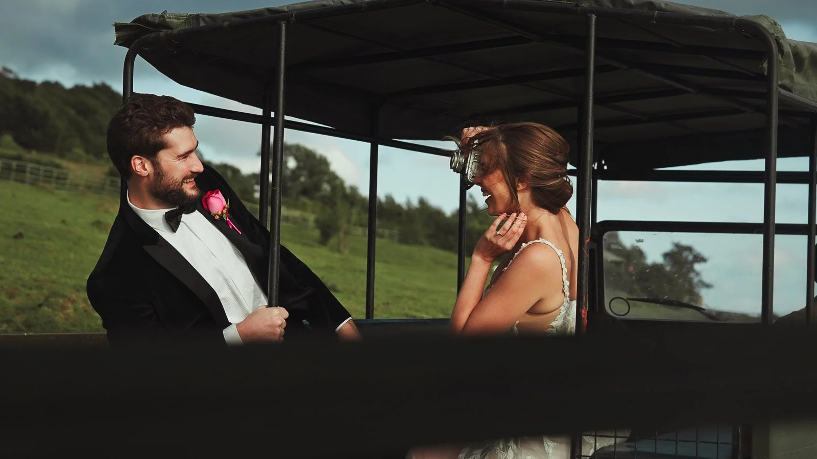
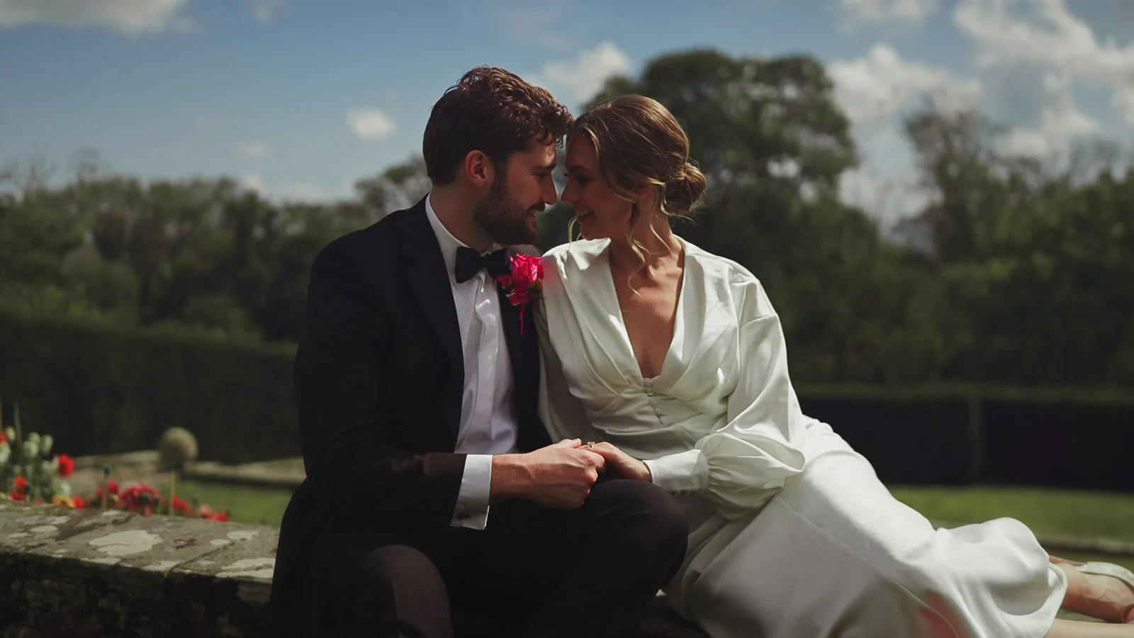
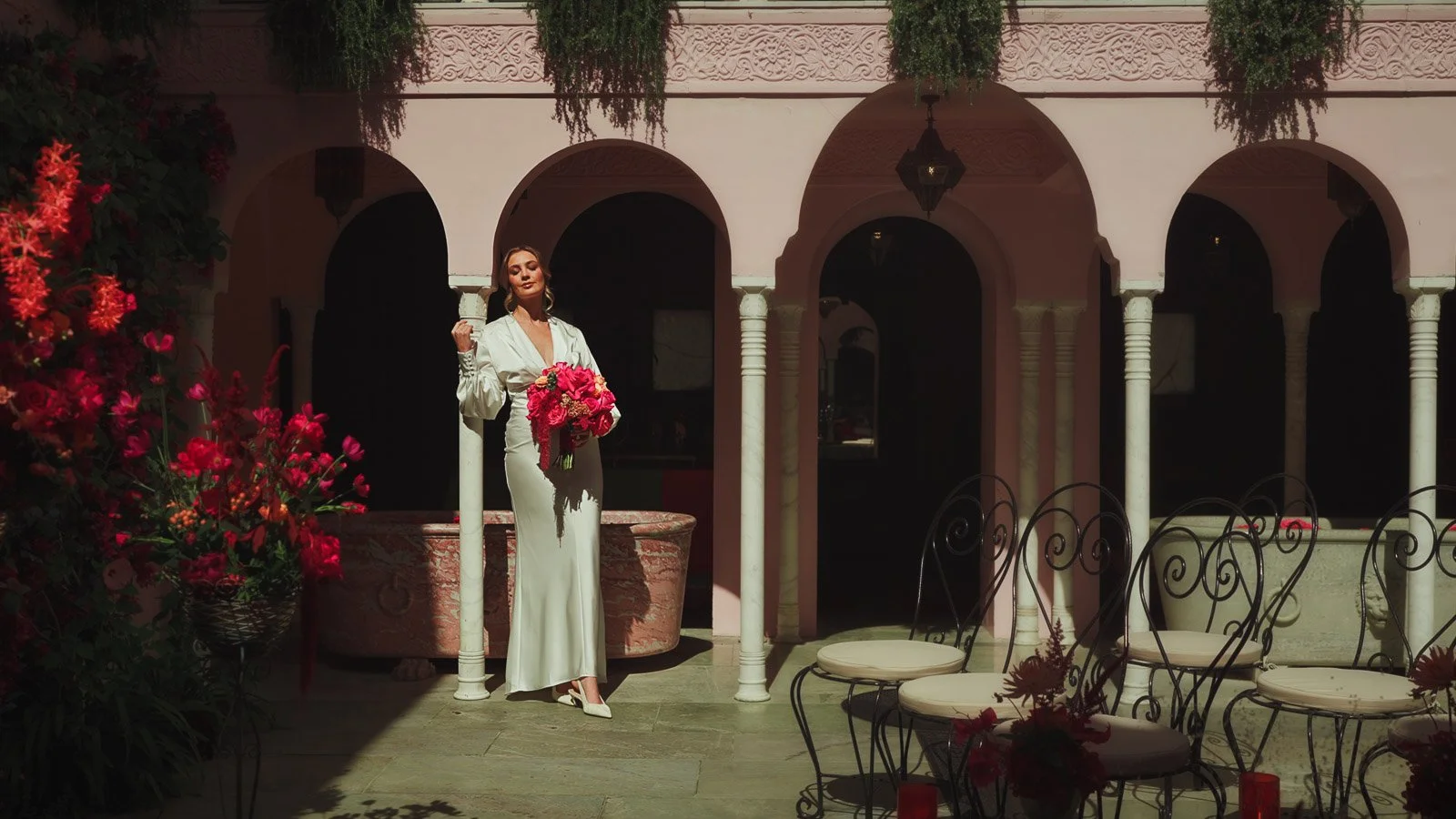
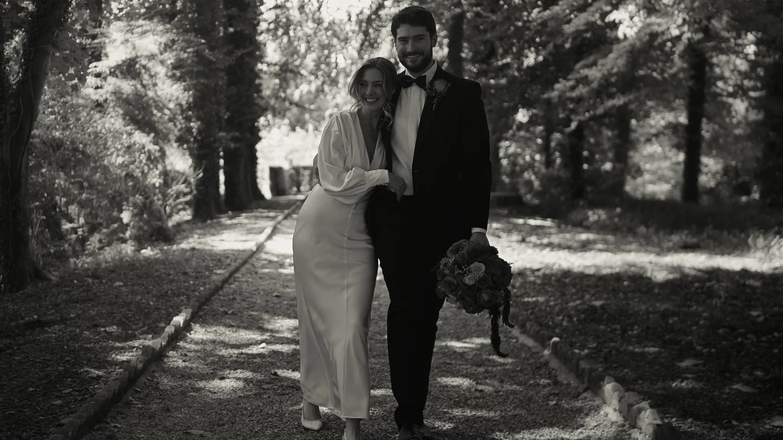
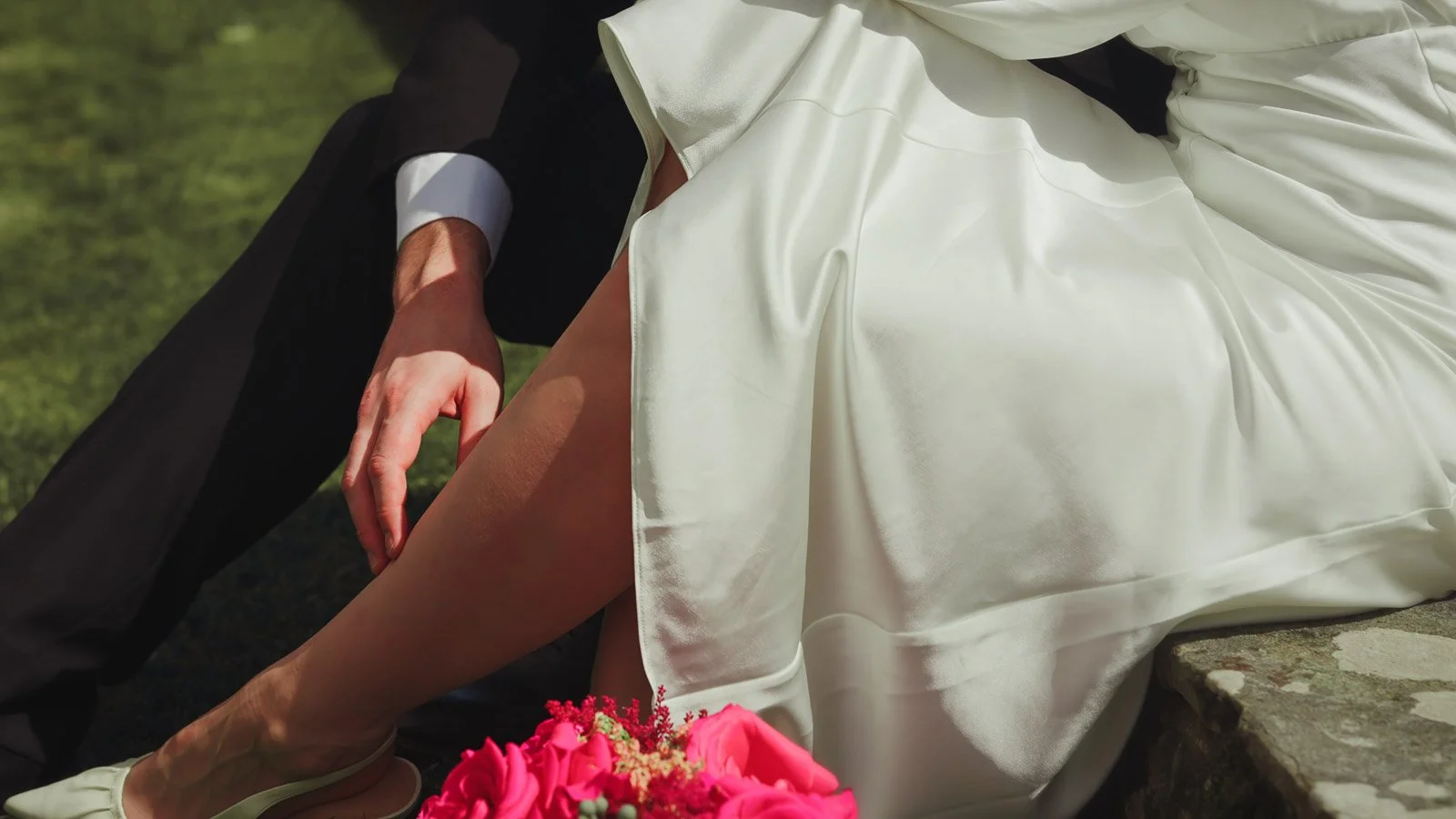
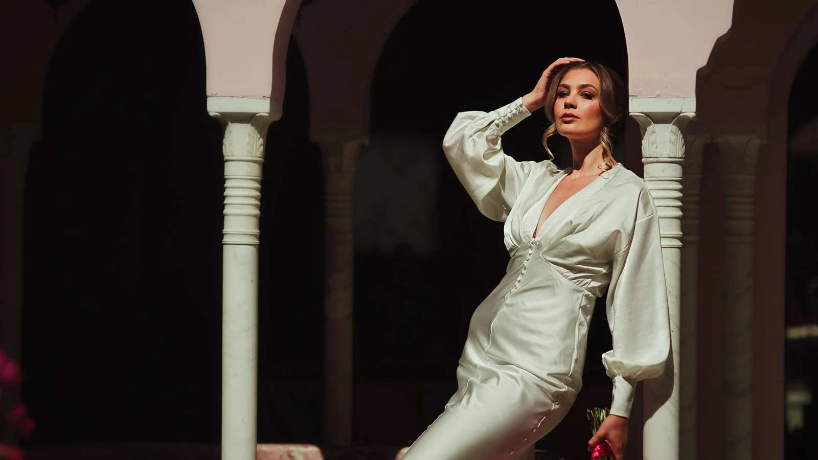
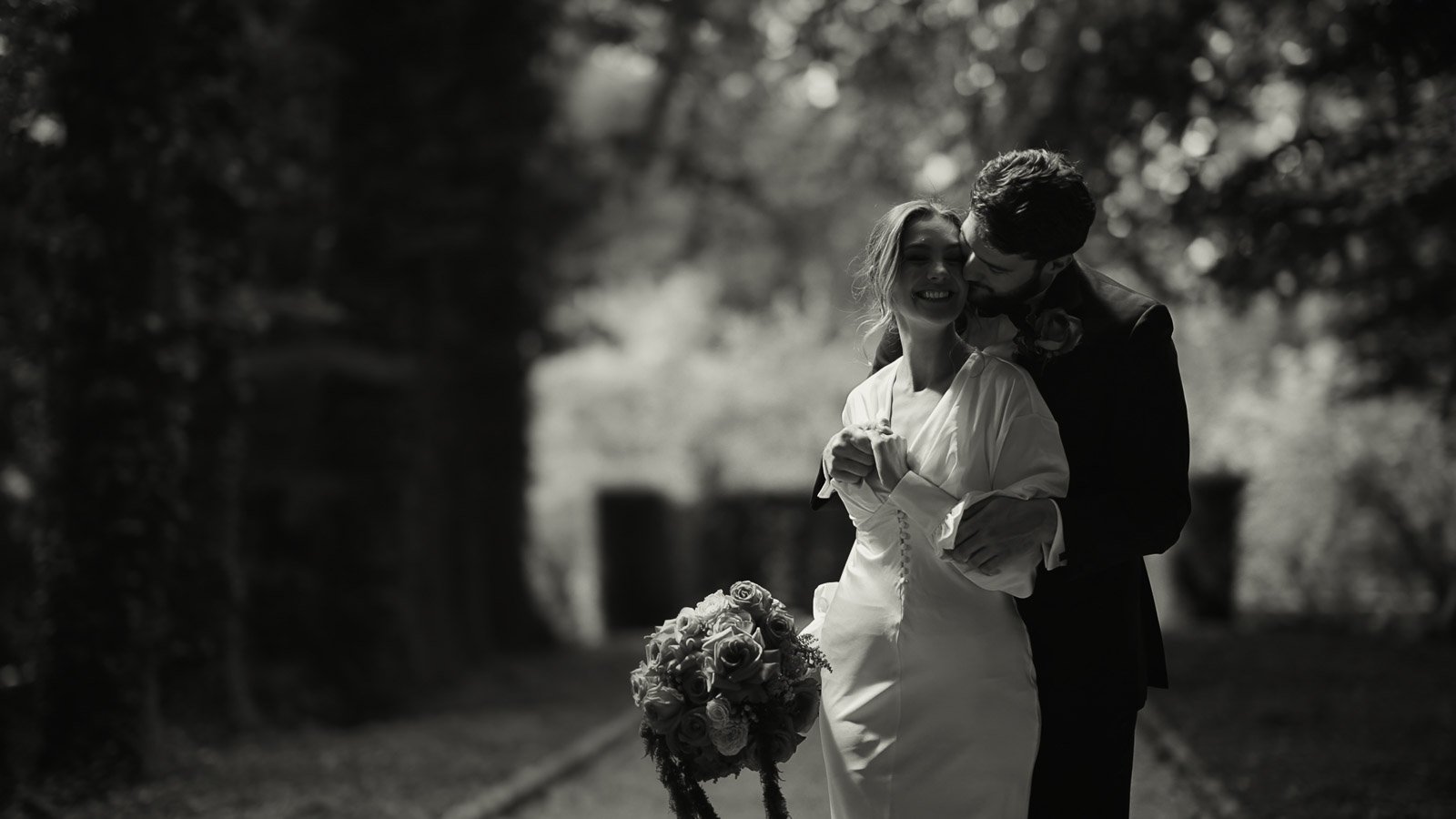
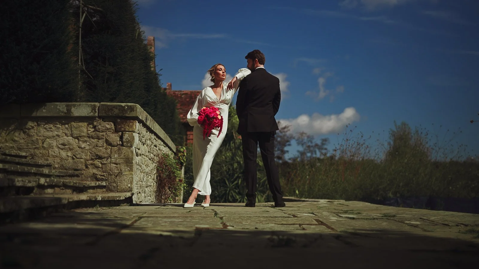
The bride wore two contrasting looks to show how fashion interacts with colour. One dress was clean and understated, giving the palette a calm centre point so the styling could be vivid without taking over. The second look brought lace, texture and a more fashion-forward silhouette, including a strong leg line that matched the energy of the colour story while keeping the overall finish elegant.
The groom followed the same logic. Traditional black tie set the tone, then a crushed velvet dinner jacket introduced texture and depth that reads beautifully on film, particularly when light softens later in the day.
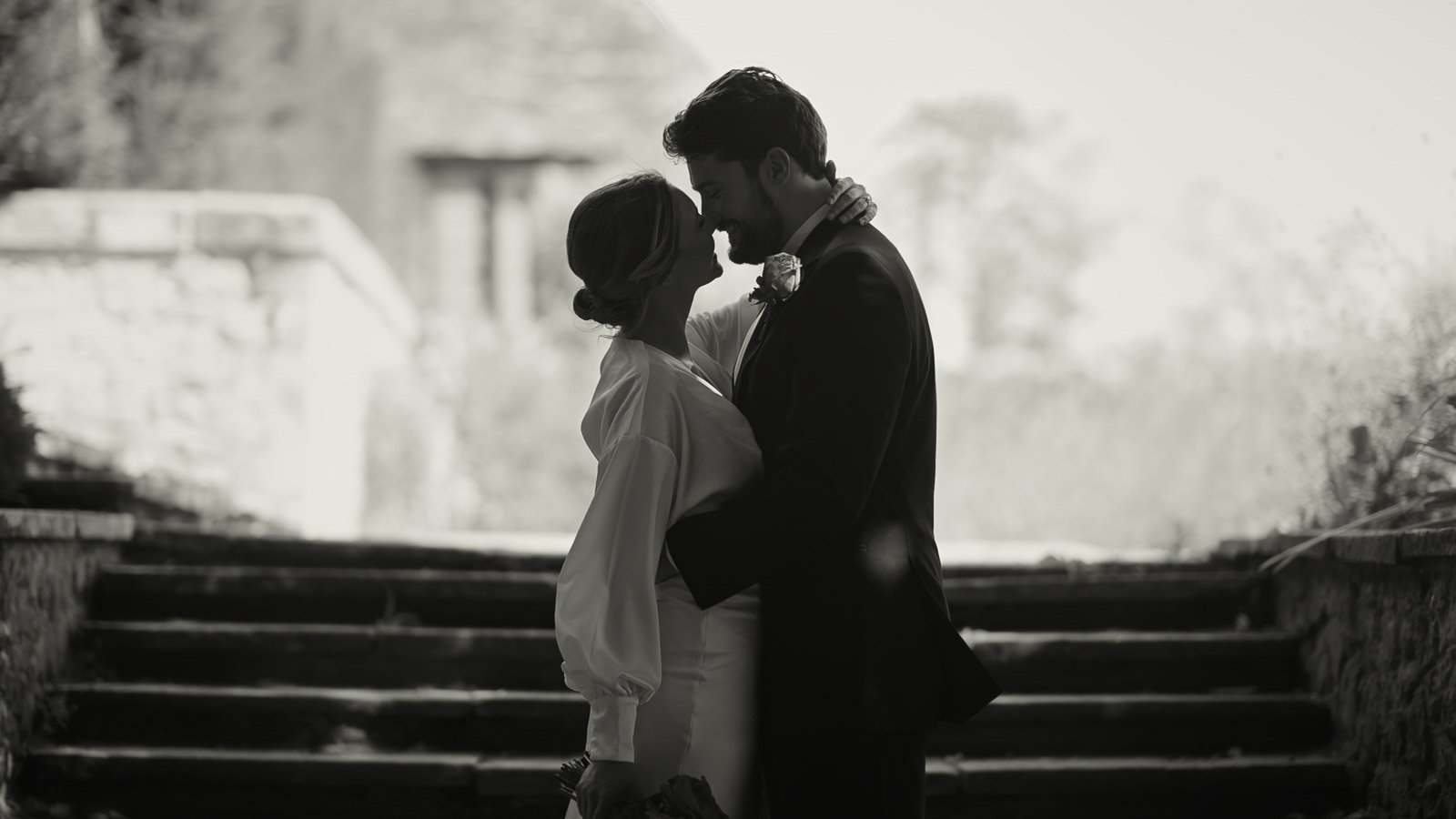
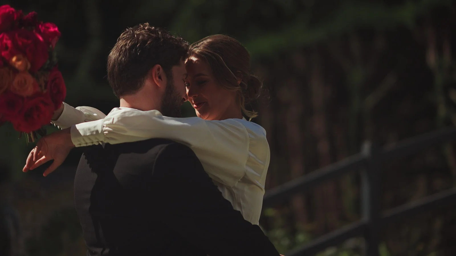
The result is bold, but not loud. Confident, but controlled. And it shows what is possible when colour is treated as part of an editorial design rather than simply a theme.
How I film colourful fine art weddings
My approach is built around composition first. When colour is strong, framing becomes the difference between an image that feels premium and one that feels busy. I look for clean lines, considered negative space, and layered frames that feel editorial rather than generic.
Movement is calm and intentional. Strong palettes can feel frantic when the camera language is rushed. A more controlled approach allows the styling to breathe and gives emotional moments time to land. That pacing also protects the luxury feel of the film, because it keeps the viewer grounded in atmosphere.
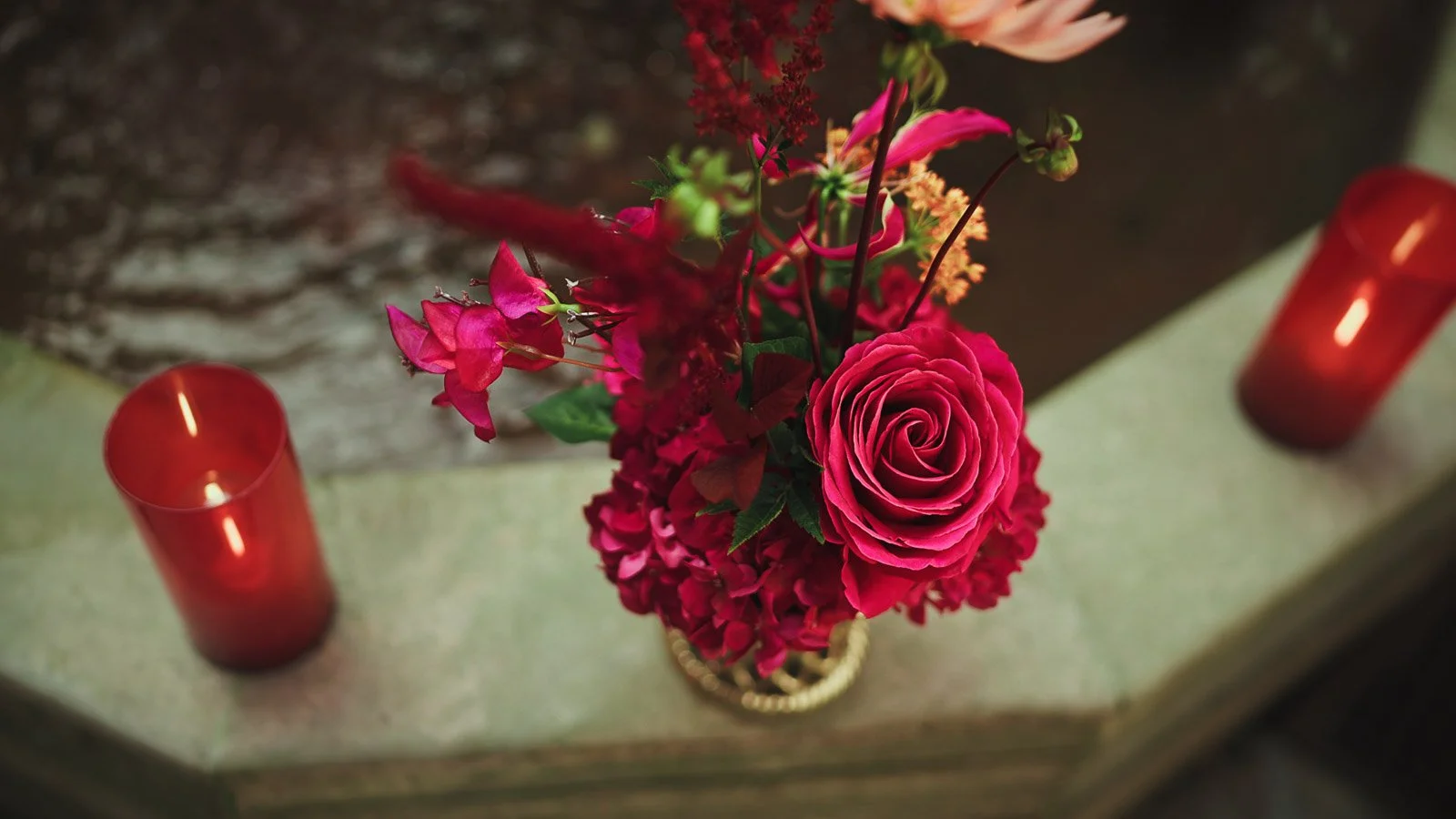
Colour is handled carefully in-camera and in post-production, with a focus on natural skin tones and consistent tone across the day. Reds are the most unforgiving colour in wedding work; they can clip quickly and they can push skin tones warm if they aren’t managed properly. The goal is richness without harshness, with colour that feels deep and considered rather than oversaturated.
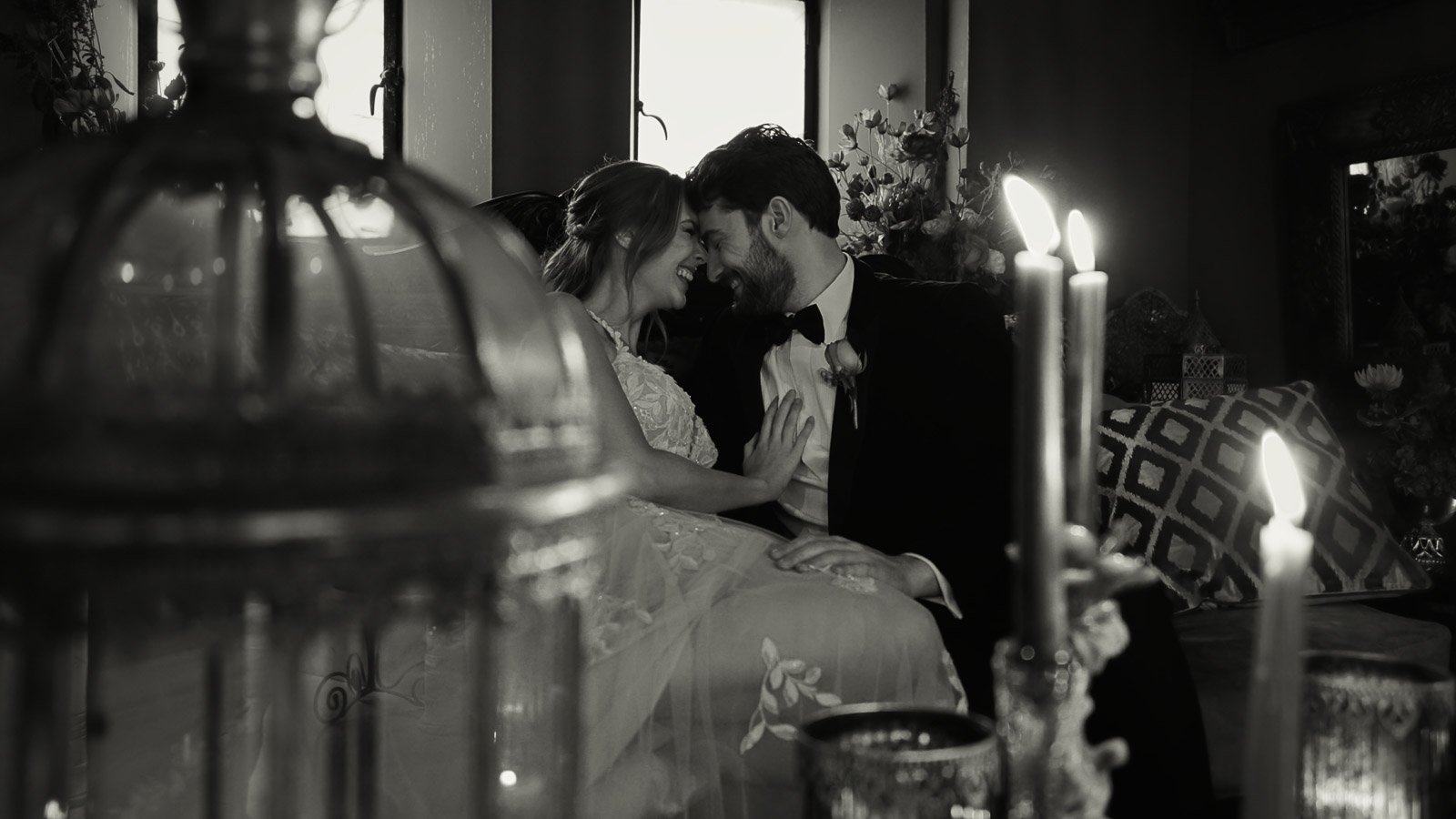
Sound and rhythm matter just as much as the visuals. A fine art finish is never only a colour grade. It’s also the edit. The pacing. The way you move between detail and emotion. The way the day builds. A film should feel curated, but still honest.
Planning a colourful fine art wedding that films beautifully
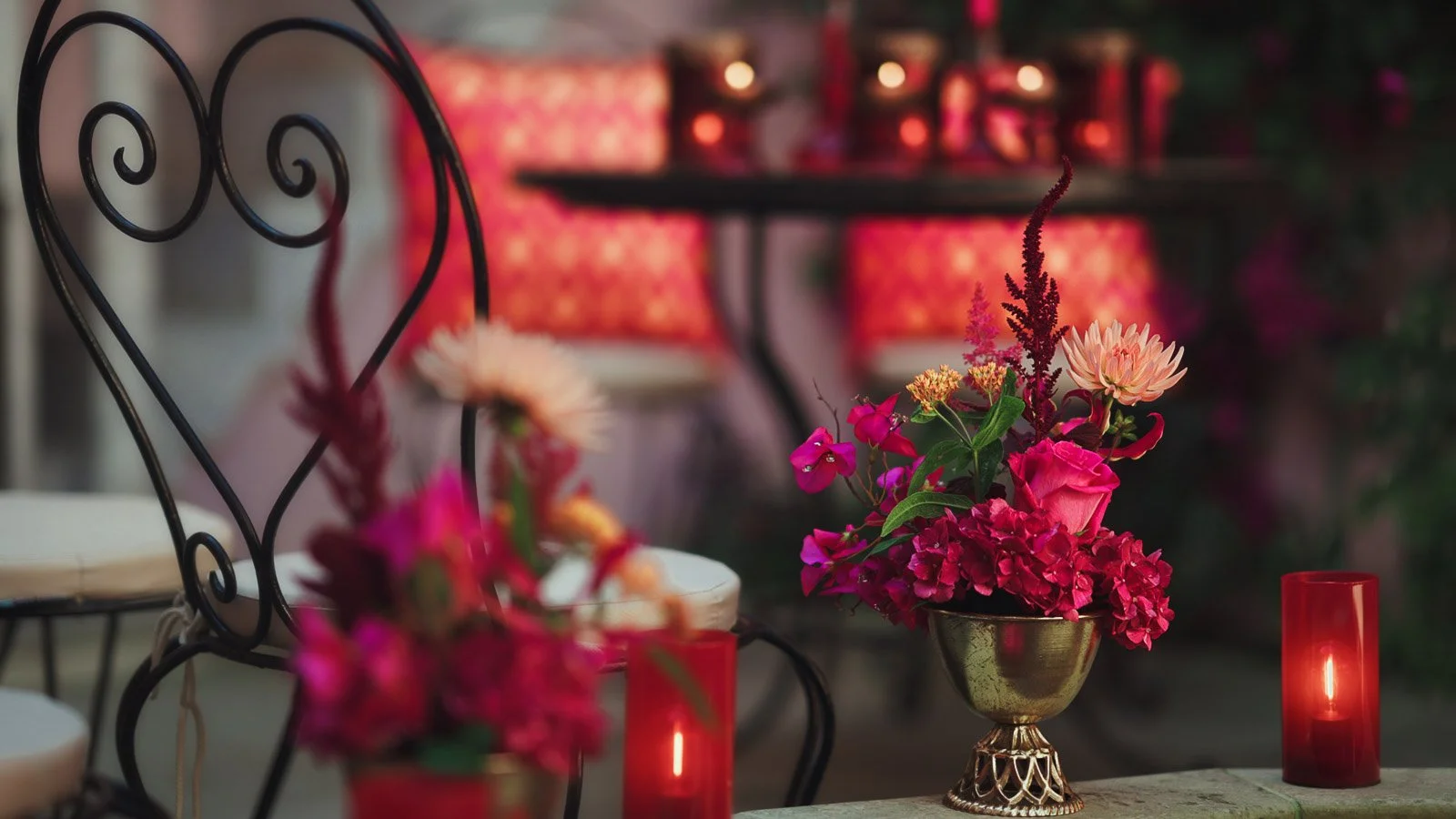
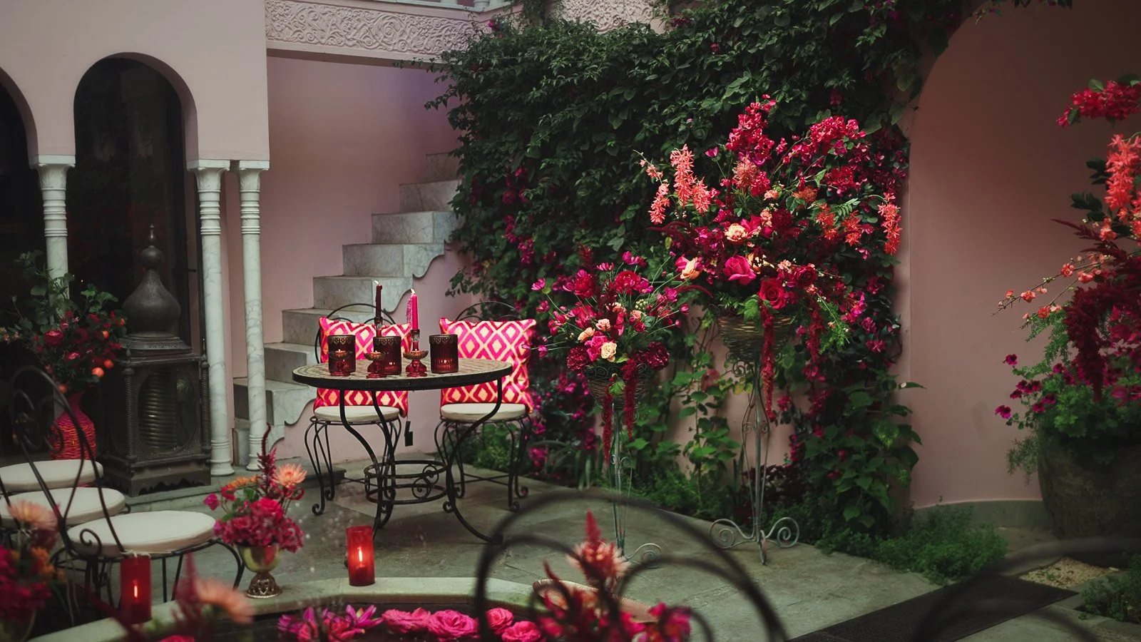
Colour translates best on film when it’s designed with contrast and restraint. Saturation feels more expensive when it’s placed intentionally rather than spread everywhere. One strong floral installation, a single table moment, or a repeated palette in a few key details will often look more refined on film than colour being scattered across every surface.
Texture is your other advantage. Velvet, satin, silk, lace and candlelight all behave differently in motion. They catch light, create depth, and add dimensionality to scenes. A velvet jacket reads instantly as luxury. A clean satin dress becomes an elegant focal point. Lace introduces detail that feels editorial when framed carefully.
Lighting choices matter, even if they’re subtle. Warm practical lighting and candlelight help pinks and reds feel rich. Cooler light can make those tones feel harsher. If you’re planning a bold palette, it’s worth thinking about the lighting temperature of your space as part of the overall design, because it directly affects how your film will feel.
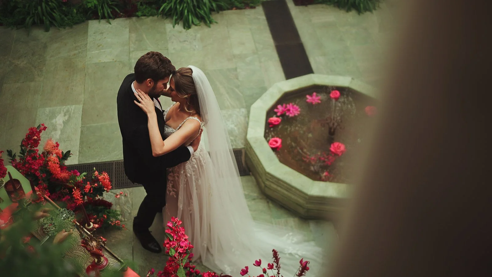
Where this style works best
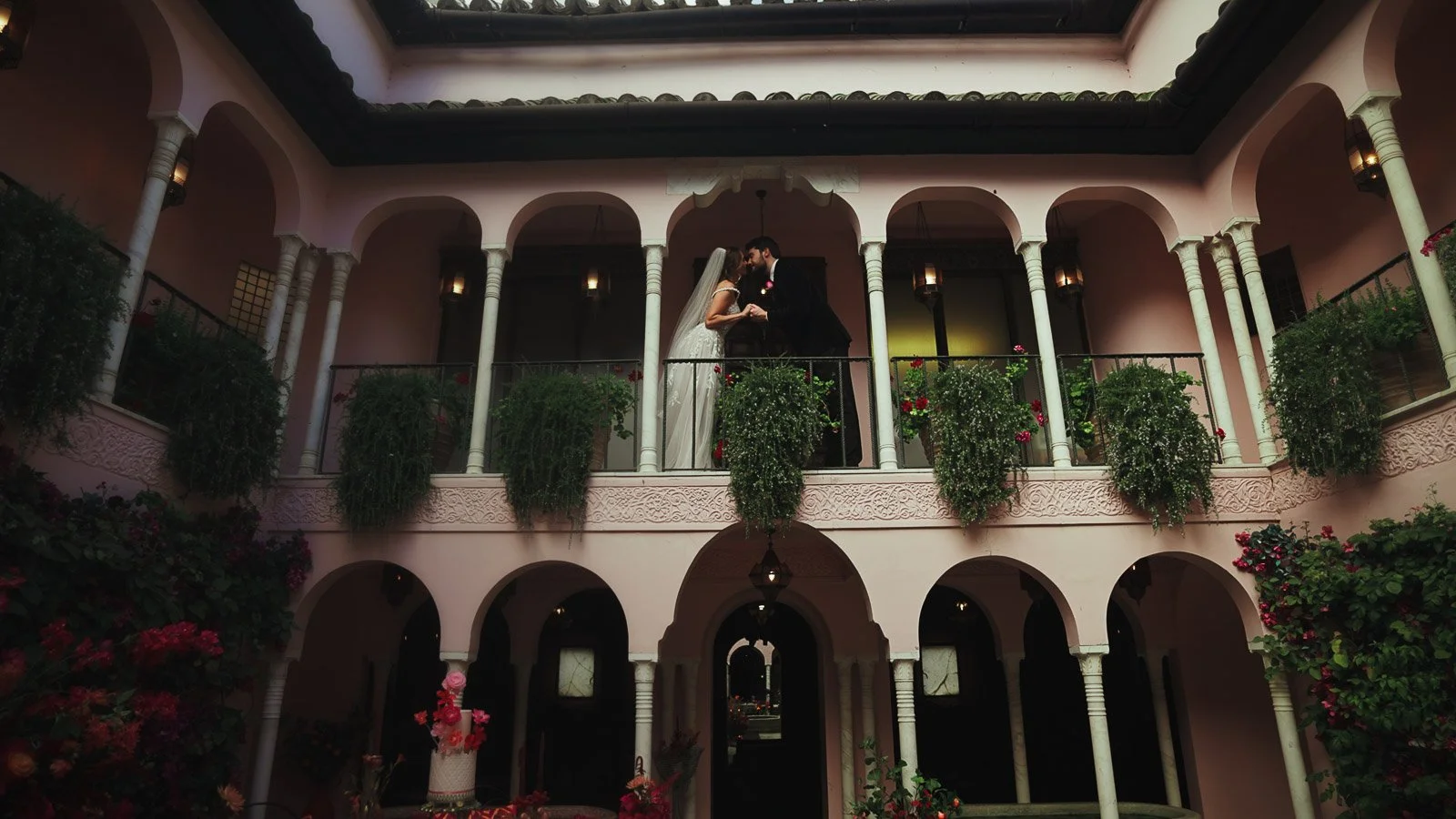
Colourful fine art wedding videography suits venues with either clean backdrops or strong character. Neutral architecture allows colour to carry the scene. Textured spaces like courtyards, archways, stone and climbing greenery give bold styling a natural home.
What matters most is controlled complexity. Too plain and the styling can feel disconnected from the environment. Too busy and the venue competes with the palette. When the balance is right, colour feels embedded in the space, not placed on top of it.
This is one reason venues like Port Lympne suit this aesthetic so well. The courtyard architecture provides structure, while the setting can hold vivid styling without losing elegance.
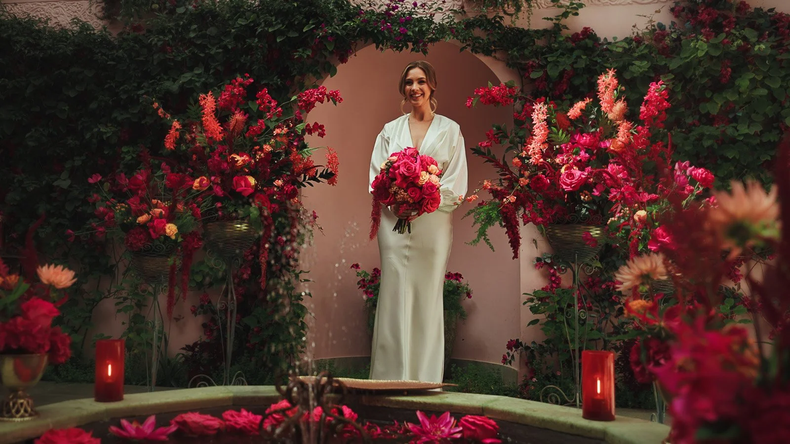
Photo and film together
If you’d like both photography and videography, I also offer combined photo & film coverage through my team. The advantage is consistency. When the day is approached with one shared visual mindset, the pacing is smoother and the aesthetic stays cohesive, which is particularly valuable for colour-led weddings where continuity matters.
It also improves your experience on the day. Portrait time is protected, transitions run more cleanly, and you’re not pulled in different directions. The result is calmer, more efficient, and usually produces stronger work across both mediums.
Get in touch
If you’re planning a colourful wedding with a fine art finish, share your venue, date, and the palette you’re building. I’ll come back with next steps and guidance on how it will translate on film.
About Luke Batchelor

I’m Luke, a UK-based wedding videographer working across the UK and Europe. My work is rooted in cinematic storytelling with an editorial eye, designed for couples who care about atmosphere, emotion and a refined visual finish.
Whether your wedding is quietly minimal or boldly styled, my focus stays the same: to create a film that feels honest, elevated and timeless, with visuals that respect the design you’ve built and storytelling that never loses sight of what the day meant.
More Wedding Films To Watch
If you’re drawn to colourful fine art wedding videography, these three films are strong references for how I handle bold aesthetics with a refined, editorial finish. Each one leans into a distinct version of “colourful” and “fine art”, so you can quickly sense which atmosphere feels closest to what you’re planning.
White Tuxedo Wedding Video | Editorial Black-Tie with a Fine Art Finish
This is a clean, fashion-led black-tie reference point where styling, architecture and light work together in a very controlled way. If you like colour used sparingly but powerfully, with polished portraits and natural emotion carrying the story, this one will feel aligned.

Botleys Mansion Wedding Film | Modern Black-Tie Energy in a Statement Venue
A strong example of black tie filmed with an editorial pace, balancing the venue’s grand spaces with quieter moments in between. If you want your film to feel elevated and structured, but still human and alive, this is a useful watch.
Colourful Riverside Wedding Video | Relaxed, Refined Colour with Marquee Atmosphere
This is a great reference for couples planning a colour-led day with movement and atmosphere, especially where florals, greenery and a marquee reception shape the visual identity. It shows how “colourful” can still feel calm and premium when the framing and pacing are controlled.
⋆⋆⋆⋆⋆


FAQs: Colourful Fine Art Wedding Videography
-
It’s a style that combines bold palettes with fine art principles: clean composition, controlled exposure, consistent tones, and pacing that lets atmosphere and emotion land. Colour is treated as part of the story’s identity, not as a filter or a trend.
-
Yes, when colour is handled with restraint. Timelessness comes from composition, light, skin tone accuracy and story structure. Strong colour becomes timeless when it’s intentional, cohesive, and anchored by classic elements such as black tie, considered styling, and uncluttered frames.
-
Reds are unforgiving, so the work starts on the day with controlled exposure and thoughtful use of light, then continues in post-production with careful colour management. The goal is depth and richness without pushing skin tones too warm or allowing reds to clip.
-
The storytelling approach stays the same, but I’m more deliberate with framing and pacing when colour is strong. Bold palettes can look busy if the camera language is rushed, so movement becomes calmer, compositions become cleaner, and transitions are built for cohesion.
-
That’s the point of this approach. The film is built around atmosphere and emotion first, with colour used as a refined layer. When you treat colour as focal moments rather than everywhere-at-once, the aesthetic reads as editorial rather than themed.
-
It’s one of the strongest matches. Black tie adds structure and negative space, keeping the couple as the visual anchor and allowing saturated styling to feel confident rather than overpowering.
-
That’s a core focus. Weddings move through a lot of lighting environments, so continuity is created through measured exposure on the day, and careful tonal consistency in the edit. The aim is a film that feels like one cohesive world from start to finish.
-
I’ll guide you when it helps, especially to create clean, editorial frames that suit a fine art look. The direction is minimal and calm, designed to keep you feeling like yourselves rather than placing you into forced poses. The emotional moments remain natural.
-
Yes. I offer combined coverage through my team. It’s particularly valuable for design-led weddings because it protects visual consistency and keeps the day flowing smoothly when one team is working with a shared creative approach.
-
Yes. I film across the UK and Europe, and this style translates exceptionally well to venues with strong architecture, courtyards, and character-led interiors.
-
The featured piece is presented as an editorial concept created to show the aesthetic with clarity, especially how bold colour and black tie can be handled with a fine art finish. The approach to composition, pacing, and colour management is the same methodology I apply to real wedding days.
-
Send your date, venue, and a short description of the aesthetic you’re building. Even a few reference images is enough. I’ll confirm availability and advise on how your design choices will translate into a cohesive film.